
When I first started out writing, I was busy with the whole ‘writing’ part of the deal, you know, putting words together to make sentences and all that jazz. Then, when it got time to get real, I slammed into the ‘oh-crap’ wall, filled with blocks of requirements held together with a mortar of doubt.
Books need a description. And they need an ISBN. And they need to be categorised according to their content and type. And, of course, they need a front cover.
Well, as far as I can tell, you can get away with not having an ISBN, and you have categories of ‘General’ under fiction which, I guess, sort of covers just about anything, and technically you don’t need a front cover to have a book published.
But it sure helps.
So there I go, flailing against the wall, doing whatever I could to get through to the other side. A front cover? No problem. How hard can that be? I mean, it’s just words and a picture right? Well, technically yes, that’s correct, there are words and there is usually a picture, but it’s not as simple as… No worries, gimme two minutes.
Cue me running around like a maniac, taking photographs with my old, clunky phone, trying to figure out how to operate GIMP, fending off the calls from work – heck, it’s eleven at night – and a whisky shot or two later, here you go:

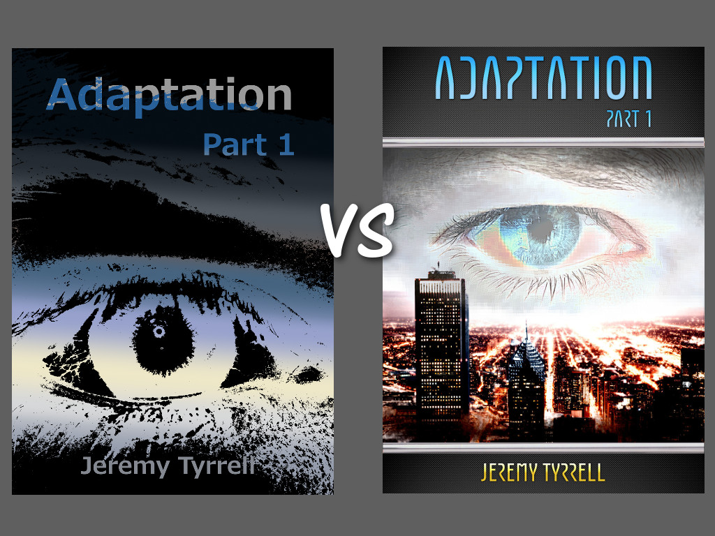
Yeah, I didn’t like it either, but you have to admit, there are words and there’s a picture, so it’s a cover, right? Besides, it was bed time and I wanted this thing up and out and off my hands (There’s a lesson right there – if you’re feeling pressured, you’re making mistakes and if you’re making mistakes, back off, go to bed and tackle it tomorrow).
Alright, fine, it was poo, I agree. So after I did the same for part 2 and 3, I sat back and thought that I’d better take it more seriously. After all, by this stage I was looking at hard copies and, yeah, these guys ain’t gonna cut the mustard.

I started with the idea of emphasising the split from title and author as top and bottom and the imagery in the middle. I found a nice carbon fibre background and a chrome bar to add the separators and changed the font to something more appropriate. And for the most part, I was happy with it, until I looked at it with fresh eyes last month and thought that looked unpolished.
The uniformity of the imagery was bothering me. Sure, the method of thresholding the image and using the darkness to create a silhouette over a gradiented background made some amount of sense, it still didn’t convey exactly what I was after. So I’ve gone and made a change, I hope, for the better.

Yes, that’s still the same carbon fibre and chrome curtain rod. Yes, that’s still my eyeball (albeit updated) but now we’ve got a more modern twist on things.
Firstly, you’ll notice the change from a single point of reference, to having the city below, a bustling, light filled city, shining in amber, contrasting the relatively cyan eyeball on top. Amber and teal, apparently, is the combination of the month. The cityscape lends itself nicely, since the perspective of the main roads naturally lead one toward the top, reminiscent of the famous ‘all seeing eye’.
I was going for a pixelated eyeball to emphasise the use of technology, but then I backed off on that since it made it look a little too 8-bit. Instead, I went for a glass-tile filter to add the squareness to it, keeping detail while still breaking the imagery up.
All things considered, I’m chuffed with the result.
[…] I’d finished with the front cover of Adaptation, I had a look at some of my other titles. Yep, you guessed it, I wasn’t happy with them. I […]
[…] the various restrictions and recommendations from different publishers like Smashwords and KDP and all of that, and designing a cover using GIMP, I patted myself on the back and moved […]