In my previous post I spoke about how I was making an animation as a promotional video for The Bullet and I got as far as laying out the scenes and getting the timing right.
For each scene I needed to get something to animate. Pictures, right? Right. Back in the old days (did I just say that?) I used to use some software that came with the Genius Mouse that allowed one to draw, fill, cut, etc. With this I could sketch an outline on the screen using a bunch of connected lines, then apply a fill and, presto! Art! I could save them in PCX format and, well, that was about it.
Enough Reminiscing!
My first thought, when approaching the task of drawing, was to open up Paint and do pretty much the same thing. Paint has come a long way from its 3.1 days (unlike Notepad, but then Notepad++ fills that glaring void) so I wasn’t too worried that I’d be able to get something knocked up. After a couple of strokes, though, I realised that it wasn’t quite suitable for my purposes.
Why not? Because drawing a picture as a bunch of pixels doesn’t lend itself to scaling or rotating or shearing without a lot of pixelation or tearing. Not only that, I freestyle draw a whole lot better with a pen or a pencil than I do with a mouse. So I made a plan that I would draw my characters freehand, take a picture of them with my phone then convert them into some appropriate format. Which format?
Well it turns out that the format I chose influenced the style of drawing. After reading up on Synfig’s tutorials, vector graphics (as opposed to raster) is ideal for 2D animation since the images are a bunch of instructions rather than a bunch of pixels. Without getting all techo, the image can be rotated or scaled or pinched or whatever and it won’t suffer the same fate as a bitmap image. The other really cool thing about vector graphics is that they behave a lot like the old painting program I used to use: The image can be built up from a set of outlines or shapes (paths, I think the lingo is), give it a stroke and a fill and away you go.
So I put the mouse down and picked up my pencil, sat down at the kitchen table and drew the characters I was after.
Sketching
I had to search through a few books and online to find the right kind of face for the job. Then is was a matter of sketching it onto some paper, rubbing and scrawling and positioning the eyes until I got what I was after.
I started with the Foreman, the dude with the cap and moustache, then went onto the Tester, the Courier (neither of which ended up in the final feature) and the Boss.
Before getting too far into it, I took a copy with my phone’s camera, transferred it over to the computer and opened it up in GIMP (www.gimp.org) to make it suitable. I desaturated it, increased the contrast and fiddled with the levels to get it into the form you see here.
So that meant I had a rough, digital sketch on my box. Yippee. Doesn’t look much, does it? It needs colour, of course, and refinement, and a solid tidying up. The chin isn’t a strong as I would like, the cap bulge isn’t in the right spot.
 This is where the whole business of turning the image into a vector affects the drawing style. Why? Because I’m not sketching to perfection, I’m sketching to get an outline. I didn’t need to colour in the picture. I could have left the moustache unshaded, even though it helped visually, since, when I make the moustache as a region, I can colour it any way I want. As you can see from the sketch, the hat has some rough shading, the chin is darkened, the hair is filled, all unnecessary.
So when I got back to making the others, I concentrated more upon the outlines of the elements within the image, and the region of shades.
The Merchant, the bald guy with the awesome chops, has his features marked out like the Foreman does, but there’s a line running from his chin, weaving up past his nose and around the left side of his head, marking a region of shadow or darker skin. I shaded his chops to help out with the visuals for later, but, again, this was unnecessary.
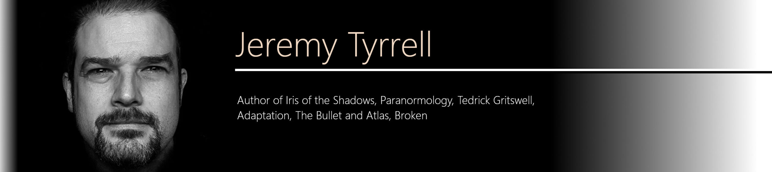
 This is even more pronounced in the Assassin, with the glasses and stovepipe hat. You can see his hat just has a rectangle marked out for the ‘shine’, and his scarf and collar are outlines only.
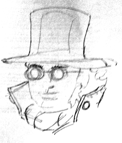
By the time we get to the Client, it’s all outlines and regions. No facial hair for him. Just a warm cloak and a decent hat. That’s the kind of guy he is.
So, to wrap up, I sketched out the characters that I wanted on paper, photographed them, downloaded to my machine, stripped the colour and increased the contrast to get a set of outlines that I could use for the next step.
Stick with me. In my next post I’ll go over how I converted these images into vector graphics that I could then use in the animator.