
In my previous post, I showed you how I sketched up my characters to bring them into a digital format.
The problem is that they were still unsuited for animation in Synfig. I had to convert them from raster images into vectors. But how? Enter Inkscape stage left (inkscape.org). I had downloaded this on a previous occasion, toyed around with it and put it away because I had more pressing, important issues to attend to. Work is like that. Anyway, I’m happy I revisited it because it’s the bee’s knees. It can convert bitmap images into regions for you, it can apply paths in layers, it can fill with gradients and stroke with different styles, and you can even muck about with opacity and geometric shapes and…
Awesome, so…
So, I inserted the image into Inkscape as a layer, with the result as shown. Yeah, it looks scrappy, but it does get better. Working over the lines into paths, I traced over the top of the lines. Then I noticed that Inkscape has a layering facility. A bright idea struck me (I still have the mark) and I worked at breaking up the image into logical parts.
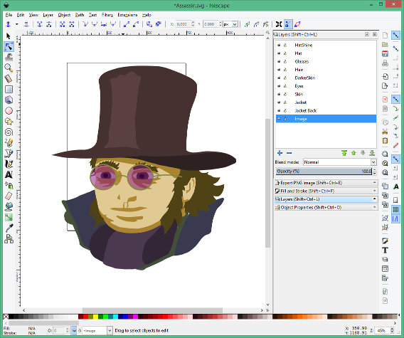
 After a couple of faces, I got into a pattern of figuring out all the different layers and regions of the eventual picture and added each of these as a separate layer. So, in the example of the Assassin here, there’s the hat, the glasses and his coat, along with the scarf. Furthermore, he has skin and hair and, on the skin, he will have skin in shadow and skin in light (Think old school, silver salt photography).
The skin will appear underneath the hair and the hair underneath the hat. Get the idea?
With each of these as layers, it was then only a matter of sketching out the relevant outlines over the top of the picture to create paths. These can then be drawn and/or filled however you wish. To make life easier, I set the opacity of each layer as 50% so I could still continue to use to the underlying sketch as a guide.
I recently discovered that I could achieve the same thing if I locked the sketch layer, placed it at the top, and set the opacity of that layer to 30%. Eh, Pot-ay-to, Pot-ah-to. Got there in the end.
I chose not to have an outline on the regions, preferring instead to let the colours do the work of definition. I like line art, but after a bit of experimentation having lines on and off and with different thicknesses, I opted to go for fill only.
Darn it, now that I look at that partially coloured sketch, I kind of like the scruffy black-lines and washed up colours. Kind of like water colours. Storing that one in the back of my head for next time.
 Continuing on, filling in layer by layer, I ended up with the images that I could then use within Synfig. I reckon I could’ve spent longer but I had time limits imposed on my venture. After all, I’m supposed to be writing Hampton Court Ghost.
These images can be exported as .svg files, and can be used as scalable vectors in a bunch of programs. InkScape has a bundle of really cool features that I haven’t had a chance to play with yet. I was going to get all fancy with some of the plugins I did get to play with (there are some really cool plugins!) only when I tried to import the resulting svg file into Synfig, there were some issues. For example, importing regions that had bits knocked out them, like doughnuts, came in as filled.
I’m not overly sure, yet I think there’s a slight disparity in Synfig when importing SVG files in the current iteration, but it’s not a show stopper. I’ll get onto the topic of importing into Synfig in a later post.
Neat, huh?
 There you have it. I repeated the process for my various characters, even for the Tester (who didn’t make it into the reel) and ended up with the pieces that I needed, ready to go. This really was a neat way to get my faces ready for animation:
Oh, whoops! I made the Foreman’s hair too dark. That’s OK, just select the hair and change the fill, adjust the hue, the lightness, the saturation.
Drat! I made him too small! Not a problem, being a vector, it’ll scale up or down without any loss in quality.
Blast! I needed a larger chin, the hat’s too short, the eyes are all wrong, I want scruffier hair. All good, just grab the path tool and add, remove or tweak the points until you’ve got it the way you want it.
That’s one of the beautiful things about this: You can add more layers to add more detail, add more points to define a better edge or, conversely, remove points and layers to simplify and posterise. I got into a rhythm of defining small paths, using the union option to join the regions together, then simplifying the path to get to a more cartoon-like style.
Creating the slug and the shell of the Bullet was the easiest of the lot. Being geometric in nature, Inkscape’s path tools made short work of it. I added another layer for the casing, and created a couple of ‘shines’ but left the gradients to be added after I imported it into Synfig Studio.
In my next few posts I’ll go through how I approached animating the scenes, you know, the ones I did way back then, and some of the problems I came across.