In the previous post I told you how I decided to try out KDP’s Create Space for the paperback version of Tedrick Gritswell.
In this episode, I’ll walk you through the uploading of the manuscript because it needs some examination, then start on the cover.
The Manuscript
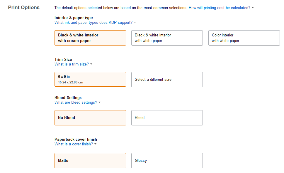
Once I had the physical output determined:

I formatted my table of contents and added in the ISBN as per Lulu’s instructions – it’s a simple enough template to follow, and I’m not about to deviate. Then I uploaded it.
Well, wasn’t that fun? I will argue that Lulu’s uploading mechanism is much cleaner and easier – you feel ‘safe’ as you go along. I will also argue that Amazon’s engine is quite advanced and did a lot of processing to make sure that my manuscript fit into its guidelines.
We can see some different approaches here: To be approved for GlobalReach, the onus is on you to make sure your book is in the right format, has the right dimensions, has the right ISBN and author and copyright, has the right pagination and table of contents. There are good resources of how to go about that, including my previous posts, so it’s not such a bad thing. It also means that you, as the publisher, are responsible for getting it right and they make sure you purchase a proof for you to check over before you can set your book free to the world.
KDP, on the other hand, takes a different approach. You upload your manuscript and it gets processed by a bunch of verifiers and validators, custom engines that grab your PDF by their dog-eared corners and shake them about, making sure its up to standard. Not that you’ll see what’s going on, but it does give prompts.
When mine came out the other end, there were many errors that were picked up, including the size of the document. The cool thing was, the engine did its best to modify my manuscript to conform to the required dimensions because, yup, I’d forgotten to set the dimensions of my page before exporting to PDF!
Why does this matter? Because by changing the size, I change the layout and flow, and the pages will, as a result, not be the same. And it seemed to get that. I’d like to try it again just to be sure, but I’m pretty sure it actually updated the page numbers and the table of contents for me. So a big tick here for Amazon on that front.
It makes sense, if you think about it. If they had to manually review all of the manuscripts coming up for quality and design issues, it would take about a day before someone hit the ‘F-It’ key and got a programmer to knock up an engine to weed out the most obvious issues before they reached a human. Nice.
Where it falls a little flat, though, is when I revised my manuscript, changed the dimensions to 6″ by 9″ and re-exported. The Auto-whatsit decided to over compensate and the inside margins of the book were too big. It took many iterations of trial and error to get it ‘just right’, which I did in the end. I think.
And that’s the other killer – currently KDP doesn’t offer the ability to purchase a proof at publishing prices. Lulu insists upon ordering one to make sure the end product is exactly what it needs to be, but there is no such facility on KDP. So I had to order my proofs as a normal purchase.
But I’m getting ahead of myself. First, the cover.
The Cover
Similar to Lulu, KDP gives you the option to DIY or to use their templates. I’ve found the templates fairly straight forward, but this time around I wanted to try the DIY approach.
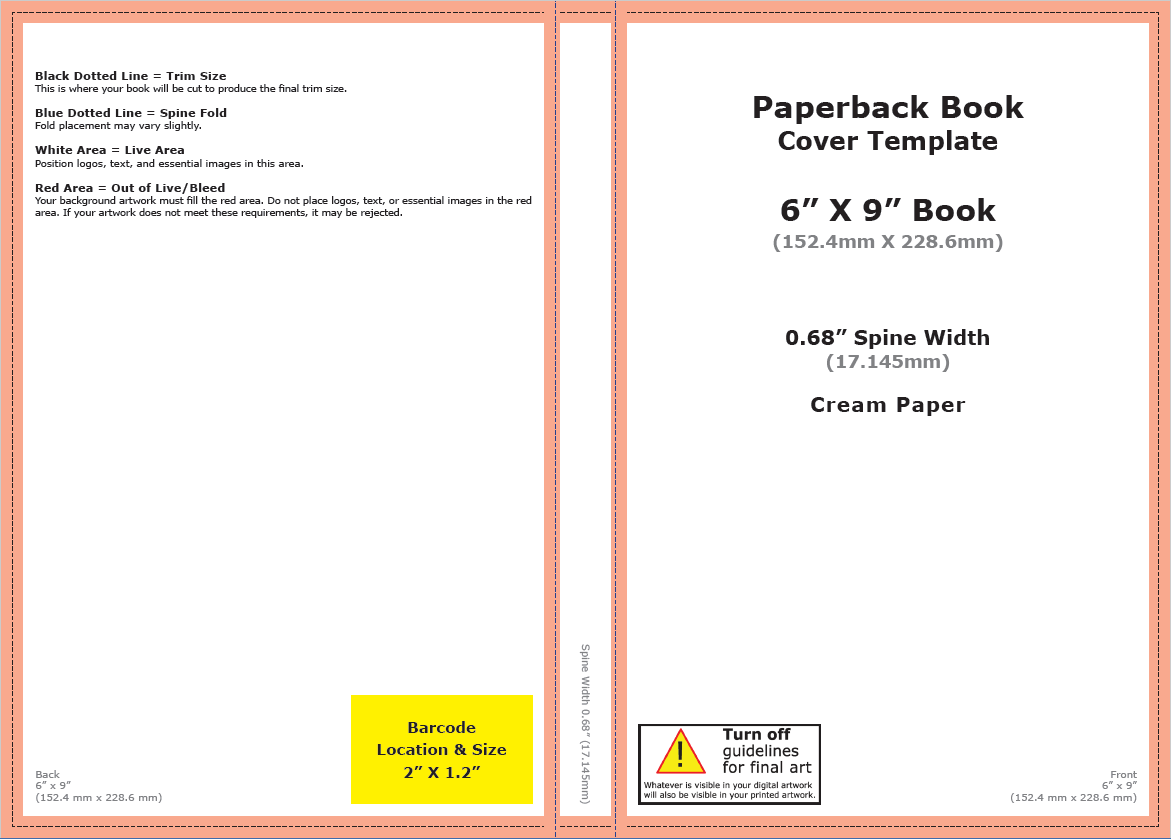
To do this you can download a PDF or PNG with the dimensions of the front, spine and rear cover. Depending on the size of your book, you’ll get a different file, but the idea is that you have the width and height, along with a spine whose size depends on the number of pages and the paper weight. Mine looks like this (PDF): 6x9_Cream_270
As you can see, it’s broken into parts. You’ve got the front cover on the right, the rear on the left – which includes space for the ISBN barcode – and the spine itself.
Do you have to make your own barcode or include it as part of the rear-image? No, not at all. It will be auto-generated when you upload it. More on that later.
The important thing to notice here is the whole loosey-goosey nature of the cover. You have red areas, black dotted lines and broad white areas. Why not just a rectangle? Because books are imprecise. The stock is not the same from place to place. They are produced on whopping great big machines with whirling parts and clampy bits and things that go brrrrrrp! and each of those processes has tolerances.
When ordering proofs of my other books, I’ve noticed that, depending on where they are printed, the colour, cut, folding and finish is different. As such, you will need to allow for the guidelines they’ve given you. Yes, there is a good chance that anything in the red-zone before the black line will be visible, but don’t count on it. If it’s important, keep it in the white zone.
Also worth noting: If you’re a stickler for having things dead-centre, then prepare to pull your hair out. That buffer and trim at the right means that you will need to compensate your centreline on the front cover to be a squigion to the left. The same rule applies for the vertical direction. Don’t assume that you can grab your eBook version and slap it on the top.
Be prepared to fiddle, is all I’m saying. After you upload, examine the finished product carefully because it won’t be exactly as you had it.
Is that all? No, not really. There’s a fair bit more to go, actually. More in the next post.


[…] the previous post, I spoke about how to get the cover to play ball. By downloading the template you will save yourself […]
[…] doing all the setup and tweaking and uploading and tweaking again, I got to the point where I could actually submit the book for […]
[…] it’s Portsmouth Avenue Ghost is up for pre-release, I need to convert it and set it up on Amazon, and then convert it again (and the cover) to post to Lulu. In addition, I need to order a copy and […]
[…] not entirely sure how this happened though I assume the fault was my own. In KDP, you create the specifications for the book, the title, the author, the content, so I must have […]