
In the previous post, I spoke about how to get the cover to play ball. By downloading the template you will save yourself a lot of trouble, but how does one use it?
GIMP
I like GIMP. A lot. I know there are other graphics programs that do a lot of stuff easily but GIMP has just been my go-to and probably always will be. Hats off to the developers.
Anyway, to use the template, open it in GIMP.
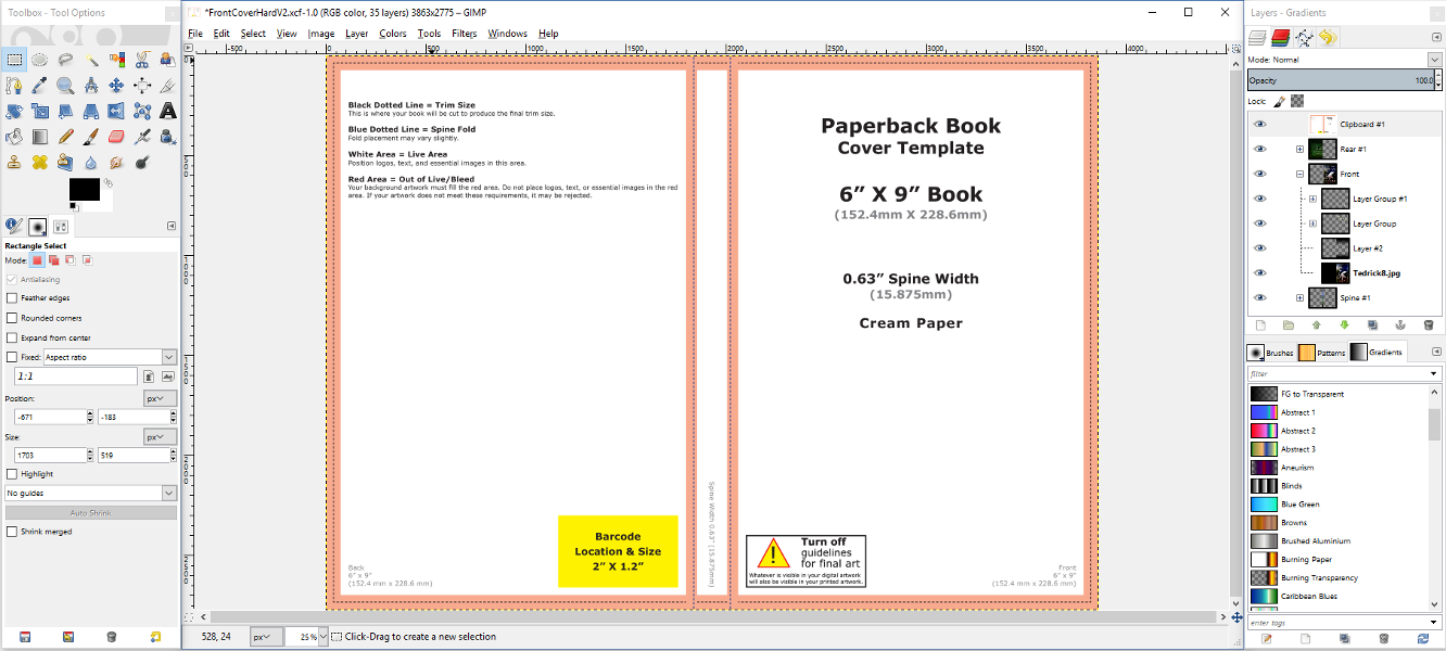
You’ll notice on the right hand side there’s the “Layers” pane. I added my front, spine and rear layers underneath. By adjusting the transparency of the top-most layer (the template) I can see how I fit in the guidelines at any time:
To turn off the top layer altogether, when I’m working on things directly, click the eyeball next to the layer. Also use this for when you’re exporting your final image.
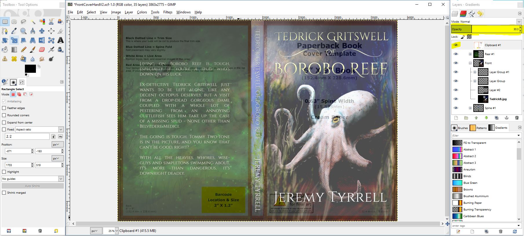
Note the rear: I’ve kept the blurb clear of the barcode area because KDP, like Lulu, will automatically stick a barcode on that spot. Can you change it? No. Why not? Because it’s a standard spot and there’s really no reason to have it customisable. It’s like software engineering, really. Yes, it probably could be customisable, and we could put a whole lot of man-hours to getting the darn thing to be on the other side, or rotated, or put on the top, or the spine. We could do that, yes. Or – OR – we could not, and recognise that it’s not really an issue and state very simply that that’s where the barcode goes and apply the developers to better, more important tasks.
Sorry. One of the most annoying phrases as an engineer I hear is, “Can we make it customisable?” Rant over. Moving right along. Where was I?
Ah, yes, the template. So you’ll see, straight away, that the eBook cover is not going to work. It doesn’t have a spine. It doesn’t have a rear. You’ll need to knock those up. I used a picture of Eel Grove for the rear, because it’s a dark image and sits well against the light blurb.
For the spine, I whipped up an underwater theme, graduating from the light to waves to the dark reef-bed. The text had to be rotated to run down the spine, and I added a slight drop-shadow to help with the contrast.
When it was all done and I was chuffed with how it looked, I exported it. KDP wants it as a PDF. Gimpy can do this, no sweat, but the resulting PDF file is 17 MB. For you spring chickens, that ain’t such a thing, but I remember the time when our harddrive was 40MB all up, and the speed of a modem of 1200 bps.
Anyhow, I uploaded it to KDP and sat back.
Boom!
Oh. Poop. What have I done? The preview window on the KDP form looks… terrible. It’s like it’s.. it’s… it’s the tiniest bit on the bottom of the spine.
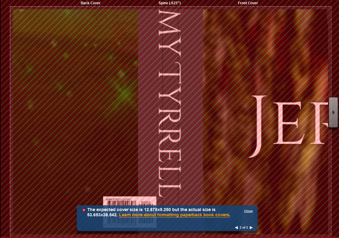
That’s what it looked like.
What has gone wrong? I’ll tell you. There’s a thing called DPI, or Dots Per Inch. Don’t worry too much about the details, but when I saved the image to PDF, it saved the data in a rather stretched format.
Back to Gimpy-boy (Yes, I call it Gimpy-boy):
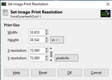
Open up the Print Resolution dialog and the mystery is revealed. See that width / height? That’s because, translating pixels to ‘dots’ on a page means that I’ve made my picture stupidly large. Aha!
I adjusted the X and Y resolution from 72 DPI to 300 DPI and the width and height went to 9.25″ x 12.88″.
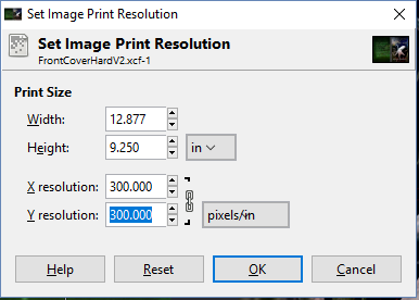
But the book is only 6 x 9, right? Yes, true, but we’re working off the template and we need to include trim and all of that. Anyway, 9.25″ is hella closer than 38″! Phew!
OK, so export to PDF again, re-upload and cross all digits and tentacles…![]()
[…] Last post I uploaded the front cover to the KDP creator. I had blundered in that the DPI or dots per inch setting was at a default of 72, rather than the required 300. Changing the DPI to 300, re-exporting to PDF and then uploading resulted in the following: […]