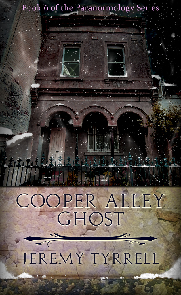
I’ve used the same general layout for the Paranormology series – Two thirds picture at the top, one third writing at the bottom. The top is of the haunted building. The bottom contains the title and author upon a close […]
Read moreTag: Template
KDP – The Cover
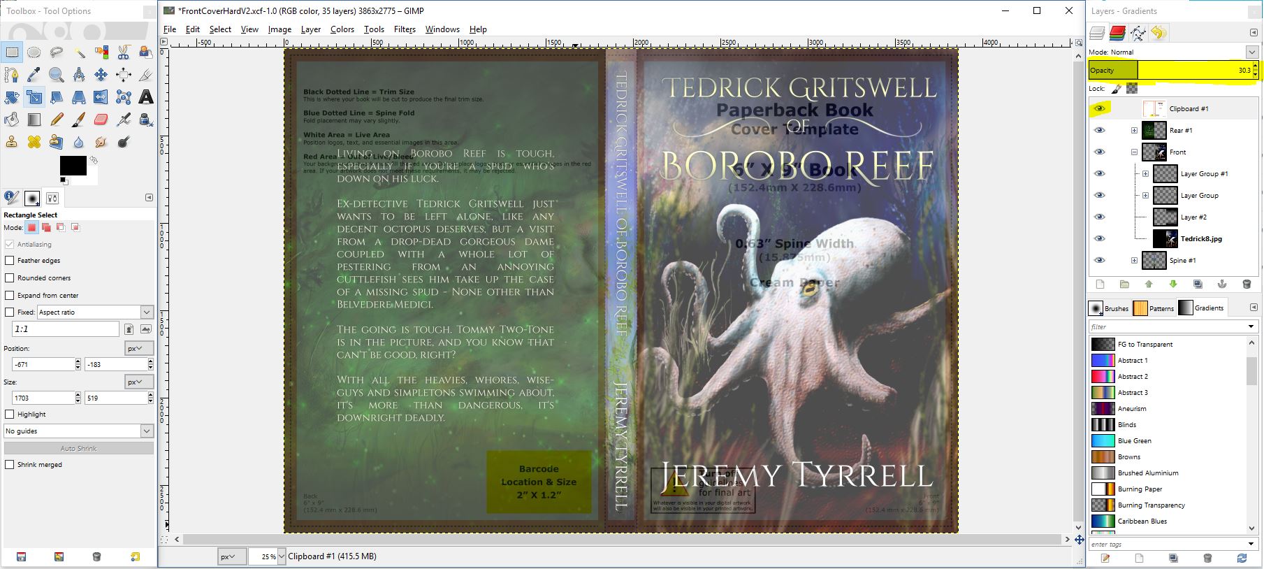
In the previous post, I spoke about how to get the cover to play ball. By downloading the template you will save yourself a lot of trouble, but how does one use it? GIMP I like GIMP. A lot. I […]
Read moreKDP – The Juicy Bits
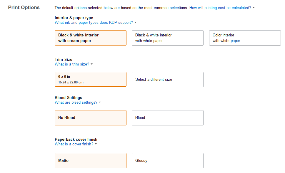
In the previous post I told you how I decided to try out KDP’s Create Space for the paperback version of Tedrick Gritswell. In this episode, I’ll walk you through the uploading of the manuscript because it needs some examination, […]
Read moreLulu – The Cover
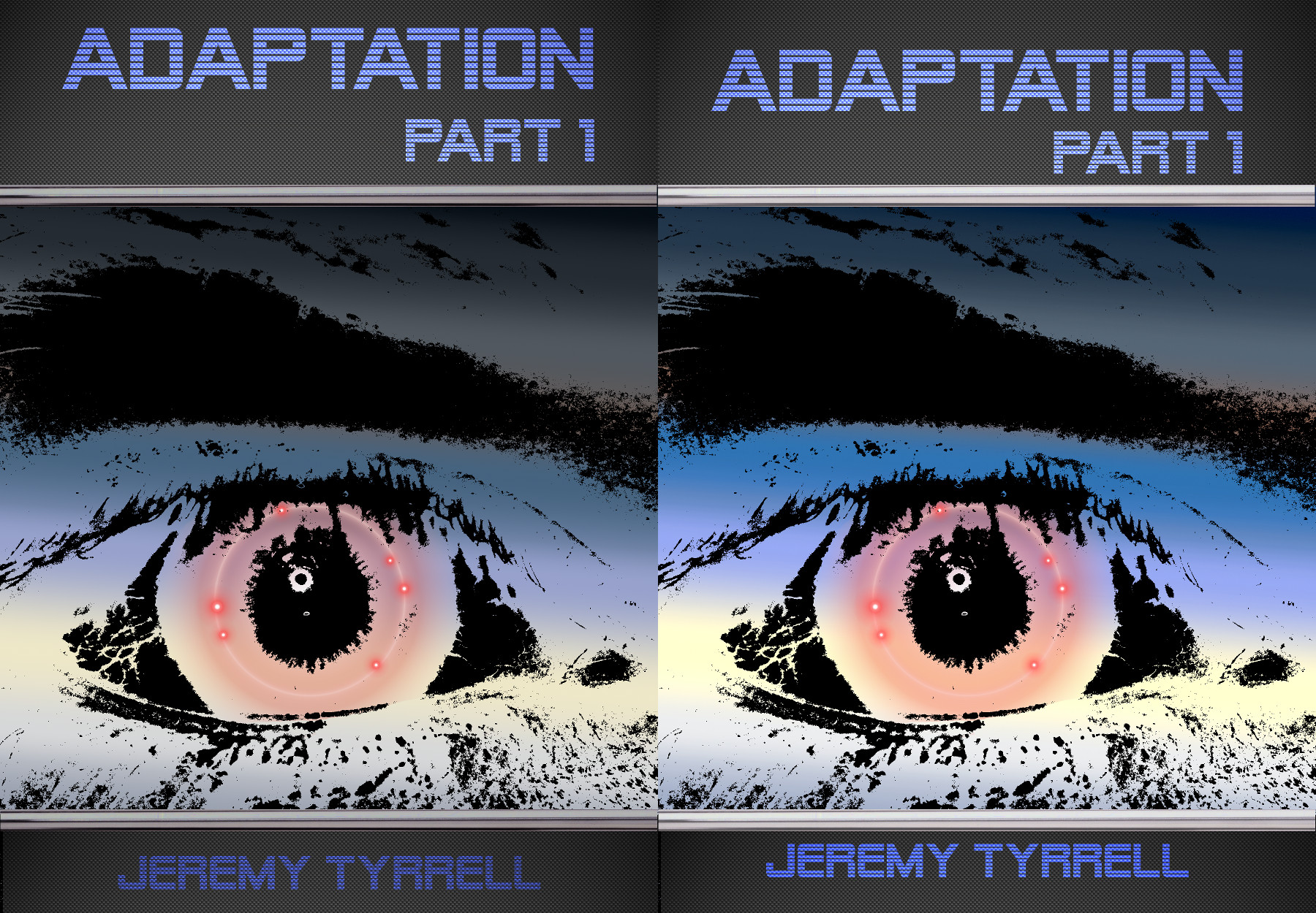
Pushing the digital version of your book to hardcopy requires a revision of your front cover. You’ve knocked your cover up. You are pretty chuffed with it because, hey, everything is just as it should be. Pixels are, after all, […]
Read more


