
You’ve written your book. Bully for you and kudos, congrats and all of that. No, really, it’s an achievement and you should be chuffed with your efforts but, if you’ve been following the bouncing ball, you’ll suspect that the journey had only just begun. That’s right. Unless you’ve got an agent who can ‘take it from here’, then you, my fellow independent author, are the shmuck what needs to take it further.
Just take a look through my previous posts about all the stuff you didn’t sign up for but get lumped with regardless. Marketing, of course, and distribution, and various platforms and formats and all of that. Well, this time, I’m going to get into a gotcha of the hard copy process: The print cover versus the digital cover.
I first used Lulu to print out my soft cover books. The process was fairly straightforward. Upload the manuscript in PDF format, ensure the table of contents matched, page numbers, etc. That’s all fine. Then there’s the cover. The cover is a bit tricky. You see, on top of the requirements of ebook publishing (1400 x 1800 pixel minimum for Smashwords) and audiobook (3000 x 3000 pixel square), Amazon’s KDP wants something in the order of 600 dpi for printing. So if you’ve got a book of standard dimension 6″ x 9″, you’ve got a front cover of 3600px x 5400px.
Sound big? Yeah, it gets big. But that’s not quite right. You also need to include the back cover, so that’ 7200px x 5400px. On top of that, there’s the spine and the bleed, so, as a rough guess, you really need a total image of 8000px x 5500px. How many pixels is that? Around about 44 million. As you can imagine, file sizes and processing start to get very big indeed. What’s more, the starting image you have, such as a photograph or a Corel painting, needs to start its life at those dimensions. It’s heller easier to go down in size than up.
You’ve been warned.
But wait! There’s more! That’s right, on top of this, and possibly more importantly, the translation between pixels on the screen and pixels on the paper isn’t necessarily perfect. What do I mean by this? Check out the following:
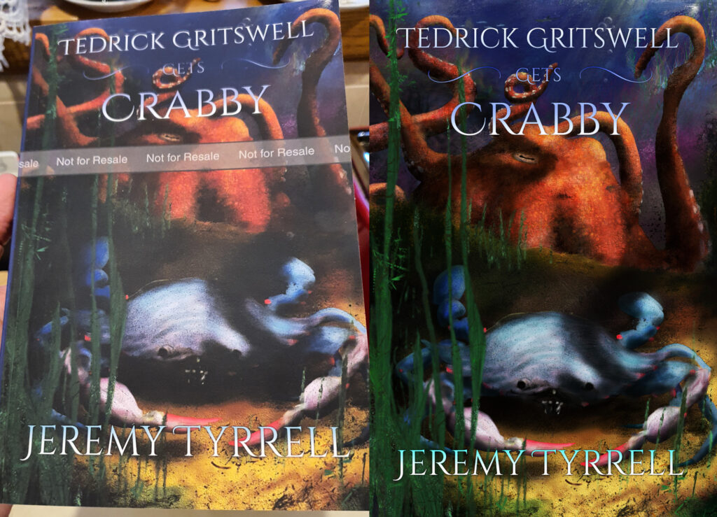
So here’s something that’s kind of hard to show properly without actually handing you the book. On the left is my book’s proof copy (the Not for Resale gives that away). I’ve taken the photo in the kitchen with downlights on it to show as much detail as possible. Under normal ‘room’ light (not outside) it’s worse. The colours, as you can see, are not quite representative of what the image on the right requires. It’s all muted. The blacks are dark grey. The detail on the crab is lost. The ‘Gets’ in the title is blended into the background. If I take the photograph again in a darkened room, the effect is more pronounced.
What’s going on here and how can it be corrected? There are two things, as I see it. The first is that the choice of cover is in ‘matte’, not gloss. This is to match the other books in the series which also have a matte cover. That’s fine, but it seems that, compared with the glossy covers, the black doesn’t get to be as dark as it should be. What I also find interesting is the green of the kelp and sea-grass is washed out as well. The reds and oranges seem to be the least affected and the whites are just fine
The other is that my monitor, from what I can tell, is not ‘calibrated’. What the heck does that even mean? I mean, red is red, right? Right? Apparently not. This is where you go and do a bit of research and come back days later scarred, broken and muttering incoherent phrases like ‘ICC profile’ and ‘Subtractive spectrum’. The point is that I’m not an expert in this field. Like, at all. But I can tell you what I know and let you go from there.
First, there’s a really good chance that if your book cover is bright enough and varied enough, it will print out acceptably fine first go. That’s what I’ve found with Lulu, at least, and with KDP with Iris of the Shadows. The image I sent over looks pretty damn close to what’s on my screen. Fine and fair enough. But I think what has happened is that, between last year and this year, I purchased a new computer and Tedrick Gritswell Gets Crabby is the first book I’ve worked on and published from this machine. That makes me think my old machine was more closely calibrated than my current one. If you want to get good guides on how to calibrate your monitor just do a quick search from your favourite search engine.
Second, the KDP process, similar to Lulu, allows you to buy author proofs. This is, I would argue, essential to making sure you’ve got it done just right. When mine arrived, I found the cover lacking. If I were the end user, I’d be disappointed with the result. I mean, the story is great (Actually, it’s a hoot!) and we shouldn’t judge books by their covers, but if this was sitting on the shelf on display, it really doesn’t give a sense of intrigue when viewed from across the room. That’s a problem. So what does that mean for you, as a self published author?
Use the galley to your advantage. Take the L. Fix the problems. Consider this the ‘first draft’, and your chance to right the wrongs. I look at the cover objectively and I spot several things that can be improved immediately:
- The text for ‘Gets’ is too dark and blends in with the water. Make it lighter and, say, yellow or gold.
- The green of the kelp is washed out. Bring it up, make it lighter and contrast the speckles.
- The shadows are nice, but they dominate. Reduce the shadow point of the book and let’s see some details.
The result is more like this:

Now, to me, this looks a bit too bright for what is such a dark book but, you have to remember, this is going to be sent for soft-back. I’ll need to do another update through KDP and then get another proof sent over. Of course, since I’ve changed the colouring of the title for the hardcopy, I’ll want to do it for the ebook and audiobook version, too. Let’s see how it goes.