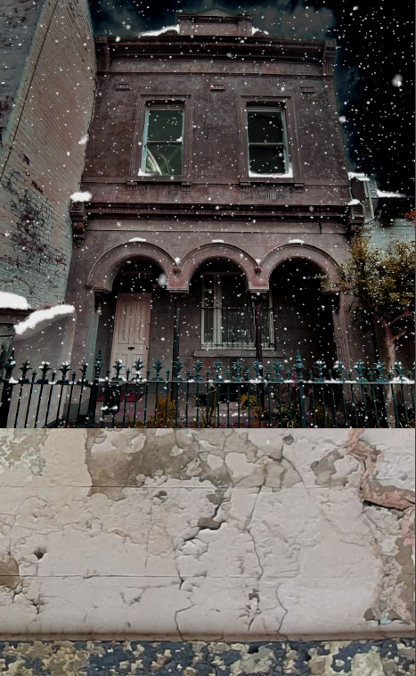
I’ve used the same general layout for the Paranormology series – Two thirds picture at the top, one third writing at the bottom. The top is of the haunted building. The bottom contains the title and author upon a close up of some of the material making up the structure.
The Smashwords guidelines specify a minimum width of 1400 pixels, with a height greater than the width. I use 1400 x 2278. For the lower section, I’ve chosen a piece of wall with some cracks and flaking paint:

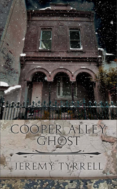
After that, I’ll add in the title and the author, along with a flourish to separate the two. I used the font Augustus because it was narrow and crisp. I’ve made a duplicate of the writing layer to have a slight coloured rim around the lettering.

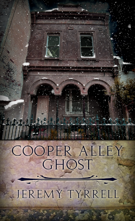
Now that’s alright by itself, but the brickwork needed to be contrasted a tad more with the writing, so I added a glow to it, reduced the contrast and added in a purple and yellow wash. I then put a shroud on the outside and bordering the two images, to give it a slightly darker look.

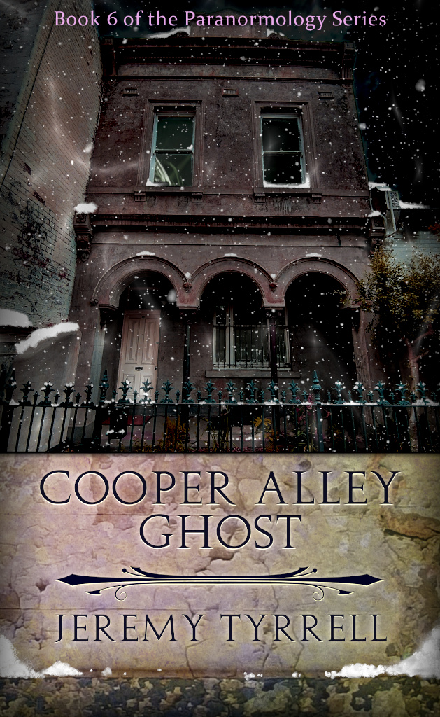
I threw in some faint plasma for a swirling, mystic look and finally added some snow at the bottom panel to tie it all in. The result:

Tada! And we’re good to go!

