Ha, now there’s a vision.
Once I’d finished with the front cover of Adaptation, I had a look at some of my other titles. Yep, you guessed it, I wasn’t happy with them. I mean, the Paranormology series ain’t so bad (except, let’s be honest, Beaumauris Road Ghost) and Atlas, Broken is almost where I want it to be, but The Bullet stood out as the poor, underloved book that just wanted to have its day.
The Bullet was one of the stories, back in 2014, that I pushed out without too much thought. It was the first to be put into hard-copy, because it was small and easy to manipulate I guess, good for a trial run. But it’s still a book and it still wants love.

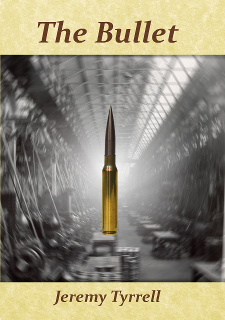
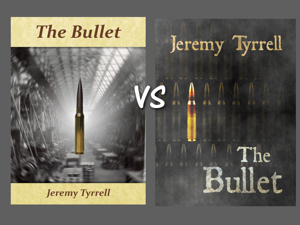
So there’s the old cover. Come to think of it, that’s the one for the print, since the text is slightly to the left and squished in a bit, but never mind that. The whole point is that while the bullet is front and centre, sure, and the story is about the bullet, the cover doesn’t really let your eye do anything more than read the text and see the bullet. The factory in the background isn’t prominent. In fact, I was showing Joey just the other day and he said, “Yeah, I like it, but what’s are all those lines at the back?”
Good lesson there, too. Ask a kid. They’ll be honest.
So I got to thinking about covers and what makes this yawn-worthy? Firstly, it doesn’t convey anything about the book apart from the obvious – The Bullet, with a bullet on it. OK, great, what else? The factory is stunted, there’s nothing steampunk about it, and it doesn’t challenge me in any way. It’s also very symmetric (aside from the squishing to fit it to a print book) so, really, there’s nowhere for the eye to go but top to bottom.
I trudged back over my source material again and looked at a bunch of other book covers and realised, yup, it needs a make-over.

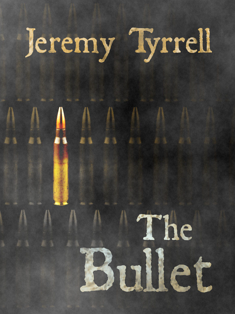
So here we have a completely different design. Firstly, it’s darker. There’s no factory to fuddle things up, but the implication is there what with all the smoke billowing about. You’ll also note, there isn’t one bullet, but many, highlighting the major theme of the story, of this bullet and its peers. It’s challenging in that it asks what’s so special about this bullet that looks exactly the same as the ones next to it. The font is an older newspaper-style, formed but haggard, rough and rusted. Lastly, the symmetry is removed, with the words somewhat right aligned, but not perfectly.
The eye is free to bounce about a bit, first gathering the bullet, then the words, then picking at the bullets in the rows to see if there is any difference between them, anything further to see through the haze of steam and smoke. The rows of perfect rounds suggests a factory, a process, so there’s no need to harp on about it.
With such a large print and uncluttered image, it looks waaaaaay better on the small scale which, as I’ve come to realise, is very important, considering most book sites display their wares in small icons and thumbnails.
I asked Joey what he thought about this one. He said, “I dunno. I liked the first one.”
Kids, eh? What do they know?
This cover change was also necessary because, well, I’ll let you know in a bit.

