It’s almost ready! But I can’t get ahead of myself. There’s more work to be done. In a previous post, I explained the differences between eBook, Hardcopy and Audiobook covers and how it makes it a lot easier if you can create your cover with all three formats in mind.
That’s great. Lesson learnt. Hindsight is 20/20. When it comes to moving the pre-existing books into the audiobook realm, however, it’s a different kettle of fish. For The Bullet, I toyed with the original cover for a while before I scrapped the whole thing and rebuilt the cover from scratch. The same for Atlas, Broken. The original cover just didn’t translate all that well to a square format. That, and it was time to update the covers, anyway.
For Paranormology, I kept the original aspect ratio, but planted the covers within the 3000px square with text to accompany it. The was because the houses in the pictures go with the book, and there is no scope to change the aspect ratio for the houses without redesigning each cover. If I were to do it all again, I’d consider a different layout altogether but, alas, I don’t have that luxury.
Tedrick, it was a bit of a mixed case. I had drawn the octopus, so I could play around with the artwork to make it fit. I also had the GIMP layout of the ebook ready to go, so it was more a matter of rearranging the whole thing to make it fit. That meant clipping the top and the bottom of the artwork, losing some of the details. Either that, or coming up with a way of keeping the original book and ratio, while adding a contextual background. Or redesigning it altogether.
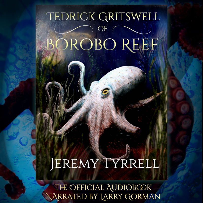
Leaving the last option aside, since I wasn’t really keen on discarding poor ol’ Tedrick, I came up with the following:

I didn’t hate it. I didn’t like it. It looked too much like I’d, well, shoved a rectangular peg into a square hole. The background was contextual, yes, but the style of pictures was too different and the whole thing felt confusing and claustrophobic. Uncool.
So then I went back to the first option and got the old scalpel out:

I kept more of the bubbles and light from above, dropping out the silt at the bottom. Eh, what’s some silt between friends?
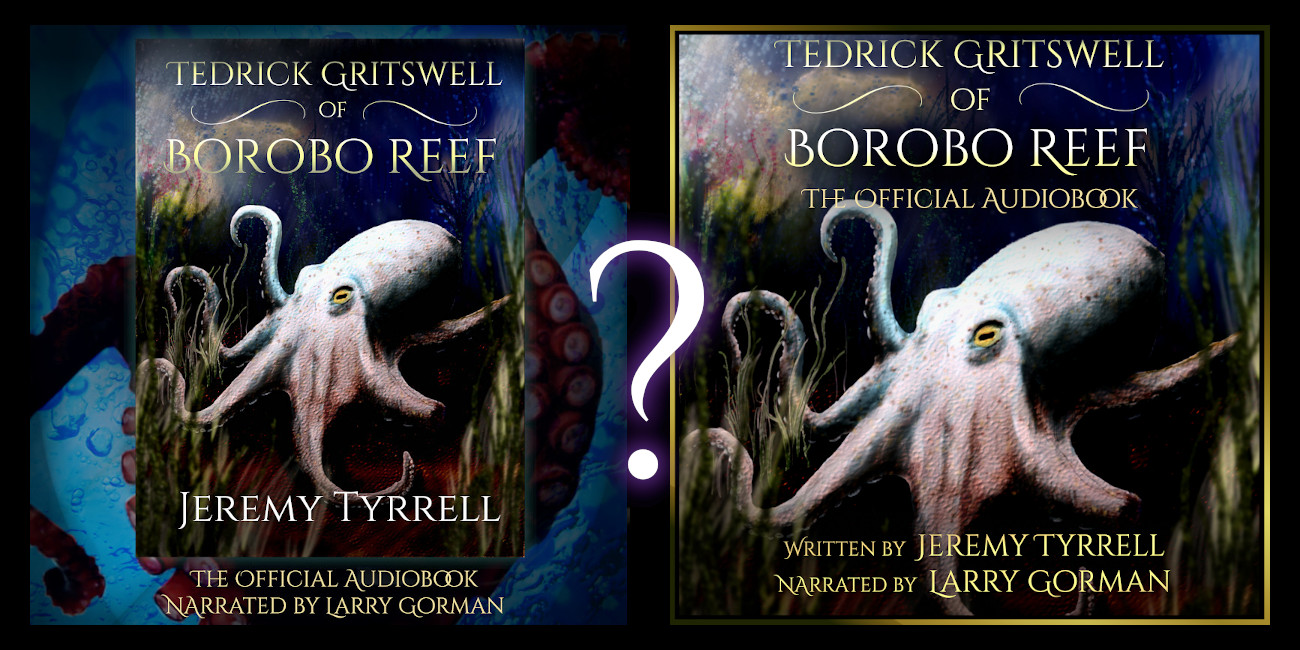
Here, I’ll stick them side-by-side for you:

In the end, I stuck with option #2, because it looked more like a CD cover would, with everything aligned to fit to the square and, though I lost a bit of the artwork, I don’t think it takes anything away from the picture as a whole. What do you think? Which would you rather see as you’re listening to the audiobook?


