Second draft of Iris of the Shadows is complete. I’ve printed it out and sent it off to my paternal editor to have a good going over with a red pen with lashings of criticism. I need to have a break from all the writing. Where did it end up? At about 202k words. It’s a hefty one.
At the same time, I’m looking at going a traditional publishing route as opposed to self-publishing. I’ve had a look before, but gave up after scouring publishers and literary agents who were just too full to accept manuscripts, or were open to residents of X country, or weren’t accepting anything from speculative fiction, sci-fi, fantasy or horror. I’ll let you know how I get on there.
In the meantime, I’m moving to the next phase of the book (Some might consider it the most important, despite what the proverb says): the cover.
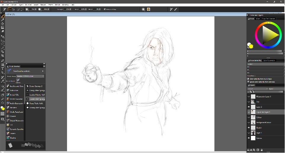
Initially, I though I might paint in watercolours, or gouache or even sketch it out in charcoal, but my efforts just didn’t match up to what I wanted. I then considered acrylics, but had no time to get that set up, so I went back to my trusty Wacom and Corel Painter:

Sketching characters is made easy, and I was making some progress here, only I had a little guy on my shoulder who said, “It looks a bit like a cartoon, Dad.” Yes, it was Joey. And, yes, he was right, it did look like a cartoon, or at least something like a graphic novel, which wasn’t really the aim of the book. If anything, the more I went along with the design, the more I just didn’t like where it was going.
I changed direction. Rather than drawing or painting or sketching a front cover, I decided to create one out of images, like I did with the Paranormal series. Thing is, old houses and cruddy buildings are easy to come by. You can walk along the street and find them lying about all over the place. People are a bit different. I can’t just go taking photographs of random people without risking having my nose whacked, and I like my nose the way it is.
For this, then, I turned to searching for stock images. There’s a wonderful site called Pexels, and another Unsplash, where you can find a plethora of images, along with links to the artists full range:
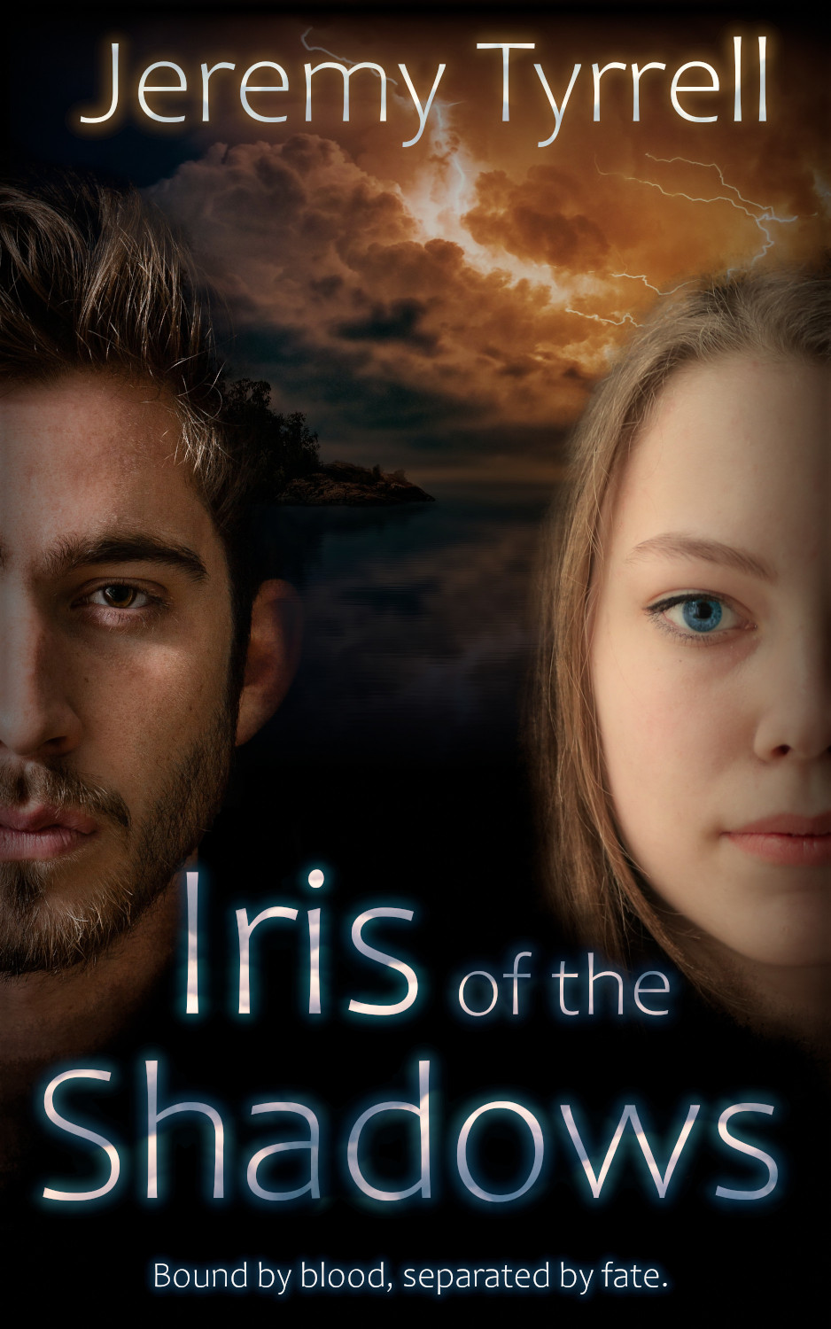
Iris was taken from a photo by Andrea Piacquadio from Pexels. Tyrone was from photo by Albert Dera on Unsplash. And the sky and sea are from Johannes Plenio from Pexels. Many thanks to these guys – go and check out their set.
A bit of Gimp manipulation, some coffee and a Monster, and here’s the result:

The images needed some work to get them to fit the mood. The girl had a few blemishes to conceal, and the lighting was a tad washed, so I enhanced the chroma some. Tyrone’s left side was too bright, so I swapped it around to to get it in shadow. The story has a strong element of juxtaposing Tyrone’s stoic nature with Iris’s chaotic tendencies, so the blue island and the orange lightning suits, and the two are positioned so as to be on the same level, but at odds with each other.
I’m not going to work it over too much, not yet anyway, but I think it really helps solidify a book by having a cover to represent it. Anyways, I think it’s time for some lunch and a celebratory beer. Ciao!


