
Forgot to mention yesterday about the quality of the print of the books that arrived.
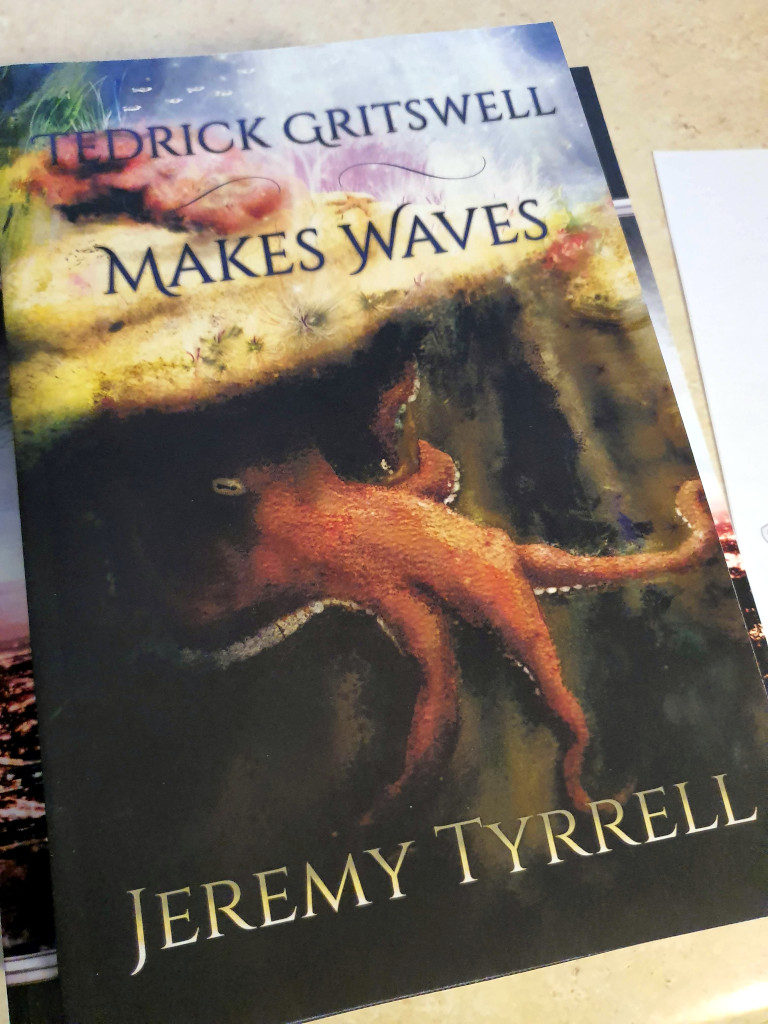
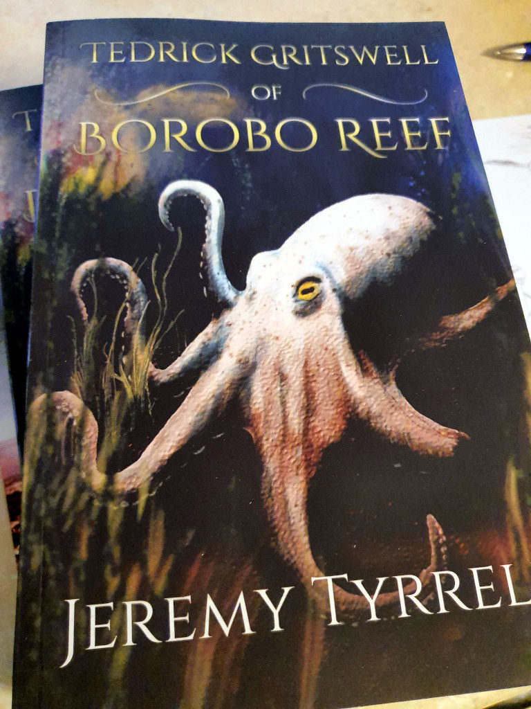
I’ll start with Tedrick. I got Tedrick Gritswell of Borobo Reef and Tedrick Gritswell Makes Waves delivered so I can give a final check to the quality of the print. I have to say, I’m impressed. The stock used was a cream paper, nice and easy on the eyeballs, with a good sized font and proper looking margins.
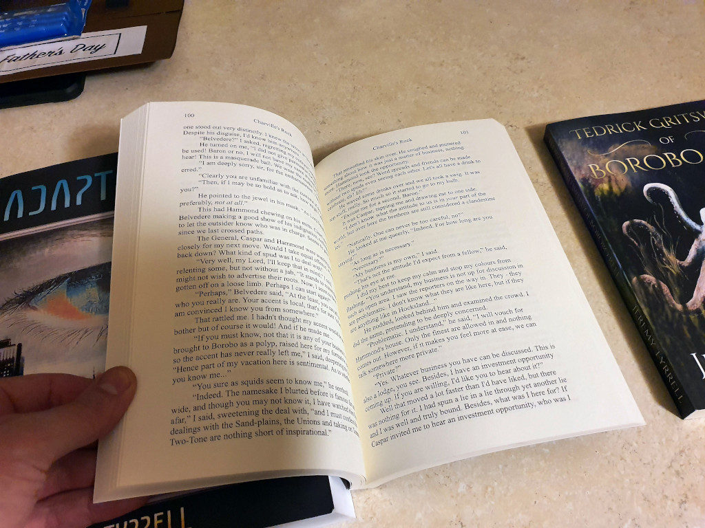
I’m always concerned with the gutter, to make sure that when the book is opened, the words don’t get lost somewhere down in the spine. The guidelines of the KDP template help out there a lot and they point out, quite clearly, if words are going to be squished in the gutter.
The margins, too, are spacious and roomy, enough for fingers to hold without getting in the way. Where the print falls down, in my opinion, is on the cover. I’ve noticed a distinct difference with the brightness of the colours on the monitor versus those on print. The books seem to have their colours muted somewhat, like the ‘volume got turned down’.
Don’t get me wrong, it’s still the same image, it’s not altered at all, but the realisation into the physical world leaves a little something back in the digital world. I’m sure there’s a term for this.
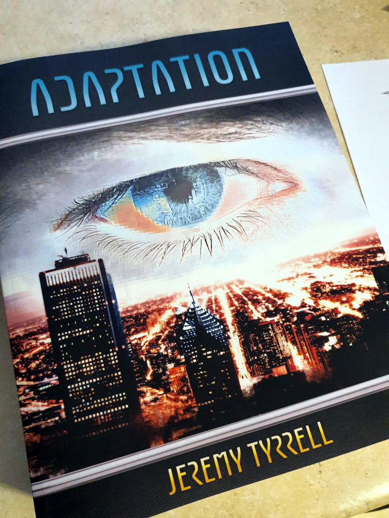
The Adaptation book is a whopper. It’s printed on white paper with 9.5 point font, 0.5 points below the recommended minimum. That was the absolute largest I could use without blowing the pages out past the maximum of 800. I also used a custom font that squished the words up a fraction more. Each chapter title also uses a custom font to match the title cover.
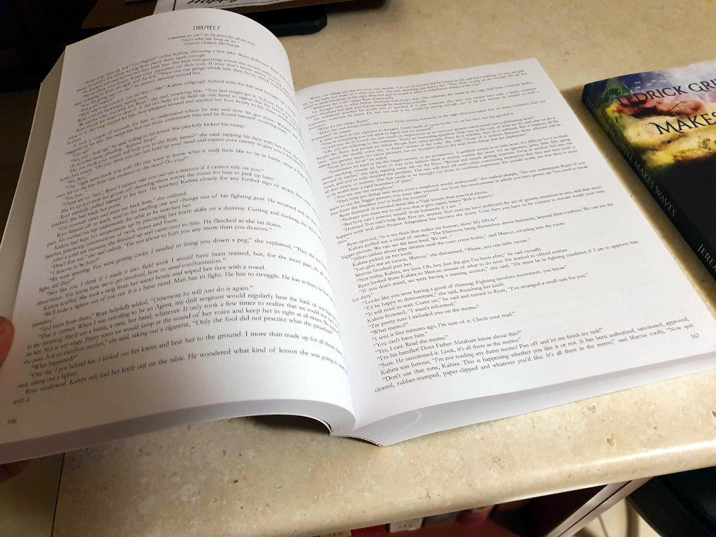
This was a bit annoying because it means embedding the font into the final PDF. If I didn’t do that, the font would default to something else, and I’d gain an extra few pages and push past the limit. Embedded the font ain’t so bad – it makes the PDF larger, of course, but that makes it longer upload.

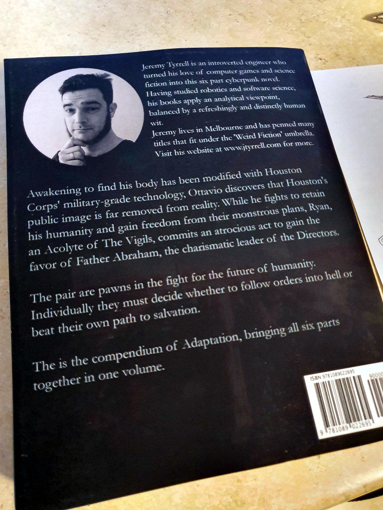
The cover came out better than I expected. The charcoal of the carbon-fibre comes up good against the cyan and orange. The back holds a likeness of yours truly in a little circle. The print quality is nice and the matt cover has a definite feel to it.
The only thing that annoys me is the slim margins and small font size. I would have preferred to go to, say, a thousand pages with a thicker margin and 11 point font but, unfortunately, the Laws of Physics only extend so far.