Left you hanging on the uploading of the manuscript. My apologies. Had to get foreign character printing fixed on Epson printers. Long story, don’t ask.
The Cover
This is where your hard work shaping the cover will pay off. You’ve made the front and the back cover, in the correct dimensions, so all that’s left to do is upload those two images.

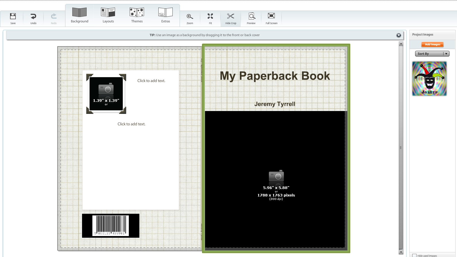
Here, you’ll find Lulu’s cover creator. It’s fairly intuitive, although a tad clunky. Hey, it does the job. You’ll see that there are a few features, like Background and Themes. Ignore them if you have your title and author in the cover image. They’re good if you haven’t included these, and are just uploading a background image in the cover.
But you have, right? Cool. So, on the right pane, there’s the “Add Images” button in orange? Click it. Find your pictures and upload.
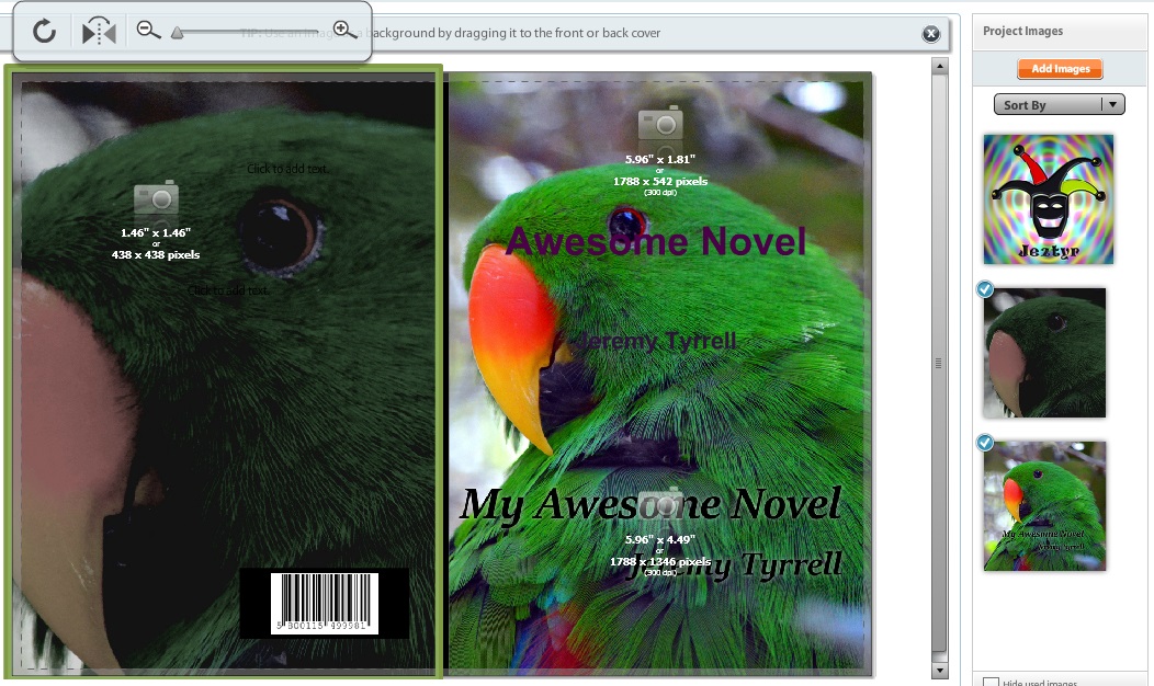
 If your network connection is anything like mine, go and have a coffee while you wait. The maximum file size is 10MB, so if you’ve trimmed your pics to the right size, they’ll be good to go. Once they’ve uploaded, click Done and they’ll appear on the sidebar. This is a picture of a rather cool bird in the Melbourne Zoo.
And this is where the prefill gets ugly. If you’ve put your title as part of the image, click on the text box with your title and author and delete the text in the fields.

I don’t think you can delete the fields entirely, unless you go to Themes and pick ‘image only’, but I don’t bother. Clearing the text suffices.
Notice, too, that the barcode of the ISBN is already overlaid (The one in the picture is not a real ISBN). That’s where it’s going to live, so if your back cover ain’t right, fix it and re-upload.
Tidy up and Blurb it up!
Clearing the text in the front page text boxes is fine, but you’ll still have those camera images hanging around. Don’t worry about them. They are there if you’ve picked a theme that has multiple picture areas. Anyway, they won’t show up in the final cut. If they really bug you, click on the Theme tab and choose a front page theme with no picture inserts.

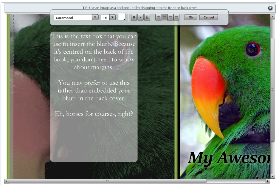
On the back cover (on the left), you’ve got a ready made text box. Use this for your blurb if you haven’t included it in the image, otherwise leave the field blank.
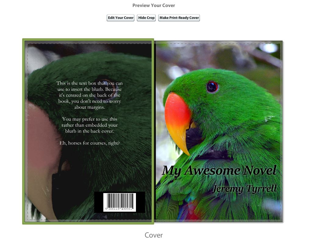
Click on the ‘Preview’ button on the bottom right, and you’ll be taken to the preview screen.
 Not bad, not bad. The little dashed lines are the ‘trim‘ lines, so anything outside of them will be lost. Remember that. Note that this still isn’t the finished product. If you’re happy with the overall job, hit “Make Print-Ready Cover”. This will transfer all of the information into one big PDF, and you’ll get to review that in the next step.
Which reminds me: If you’re not satisfied with the manuscript or the cover at any stage, even AFTER you’ve published, you can go back and change it. Just know that Lulu insists that you check your book carefully to make any necessary changes BEFORE you publish.
More on that in the next post.

