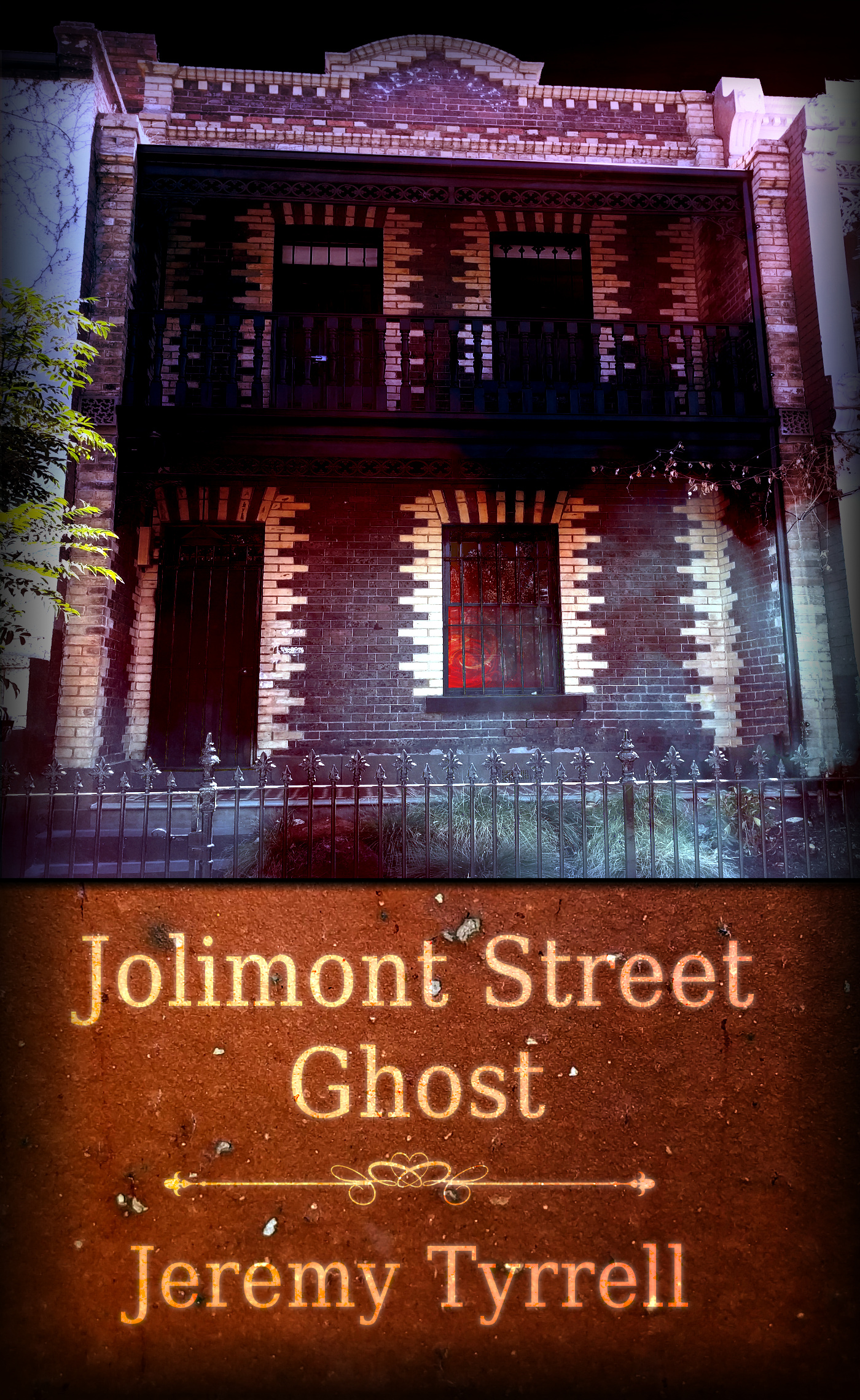
For the next in Paranormology, I’ve gone back to the beginning in terms of my front cover, except that, unlike Grosvenor Lane Ghost, Jolimont is a fair bit darker and nastier.
Now, for the past three covers I’ve been the creepy guy curb-crawling around Essendon and Moonee Ponds looking for the appropriate house but, for this one, I needed a particular kind of townhouse: Two story, short front yard (if you can call it that) sharing its walls with its neighbours.
Yes sir, that meant a trip to Carlton.
Annoyingly, a lot of the best fits had trees in the way, or bicycles hanging out the front, or garbage bins overflowing with junk. I managed to get two decent houses, one a blanch (boring) white and the other a yellow and brown brick.
Guess which one I chose?
Anyway, here’s a sneak peek of the cover in progress.

I reckon the contrasting bricks makes for a most interesting title, don’t you?
Fun Fact: For the eagle-eyed of you wondering why the text is offset from the right some, that’s to do with the hard-copy version of the front cover.
Because of the way the printing presses work, you have a margin on the top, right and bottom of the image that is going to get snipped off and, what’s more, there’s also a ‘safety-margin’ that, again due to the manufacturing process ‘may’ get snipped off, and then you’ve got the ‘guaranteed-to-be-in-there’ bit.
There’s no margin of snipping or safety on the left edge, hence the left bias.
I’m making a habit, now, to start with the hard-copy version first, and tweak the wording over to centre for the electronic version. Stay tuned for more updates for Jolimont Street Ghost!

