Even with my plan in place, I’m not entirely sure how this is all going to fit together. What I do know is that I can’t sit around umming and ahhing to the point where nothing is done.
That’s a philosophy of mine: When stalled, do something. That something might be thrown out later, but at least there’s something to throw out AND more often than not, whatever you’ve got has got a chance of being exactly what you need.
Waddya got?
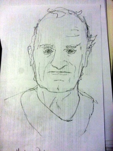
So I looked through my pile of ‘Things that I’d like to show in the animation’ and picked out ones that formulated a scene in my head.

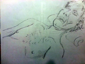
The first is Brother Holland and Master Pietro. I’ve got a half-idea of Master Pietro discovering the murder, and a close-up of Brother Holland’s blood-drained body. Master Pietro will be aged, weathered, gnarled. That won’t be too hard. Brother Holland, however, will pose an issue.
It’s one thing to draw a face, another thing to draw a face in recline, and yet another altogether to draw one that has had all of the blood siphoned out of it.
My first few attempts looked too healthy, too plump and firm. Kind of like a movie where they slap a bit of tomato sauce on the hero to show that he’s been beaten up, yet you can see he’s still fighting fit and feeling well. Hmm.

I then trawled the internet for examples of mummified or desiccated corpses. OK, that wasn’t fun, and the example were too dehydrated. It went in the opposite direction. So I mixed a bit of both and ended up with something that might pass as Brother Holland, staring at the ceiling with his lips drawn back over his teeth.
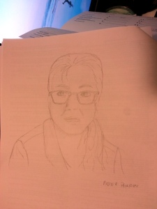
Last one my list of must haves is Miss Penelope. She’s not someone you see the back of. Nor her profile. She is always looking your way, watching, observing.

Now, Miss Penelope does a lot of talking, but no one wants to see a head yapping away, so I’m thinking I might include the head shot in some kind of introductory way, perhaps as a contextual piece or to juxtapose the various ‘action’ oriented scenes.
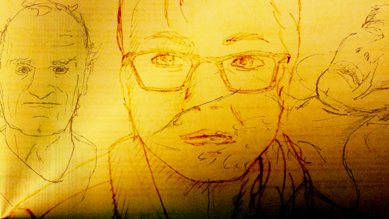
One thing you’ll notice is that there is print on the back of the images. This is a mistake of mine: To save paper, I used an old proof of Hampton Court Ghost and drew on the back.
Now those letters are coming through on the front. I’m concerned that, with the paleness of the pencil, upping the contrast to get some lines will also include artefacts from the print. I’ve run into that problem before and I’ve found that re-taking the photo with a black piece of paper behind the image works well enough, but we’ll see.
In any case, these are the first of many that (fingers crossed) will give me enough material to work with.

