If you’ve been following along, you’ll know that I started off this whole animation project with defining a bunch of scenes I wanted to render, converted some sketches into vectors and I figured out how to make stuff move.
By putting in a background and having layers for your characters, you could very easily knock up a South Park looking animation, or even a smooth transitioning storyboard, depending on what you’re after. If you’re after motion of parts of your characters, eyes, for example, or mouths, you’ll need to get into some of the finer points.
Animating Paths
The scenes for The Bullet did not call for a lot of motion, contrary to what the subject matter might suggest. As I was getting through it, though, I figured I wanted a bit more realism with my characters, the Worker and the Assassin especially. The eyes of the Worker were quite important since, if the Bullet went under his gaze and his eyes did not move, it would destroy  the notion that the Bullet was being scrutinised.
Having already labeled the layers that held the eyes, it was easy enough to identify them. Had I known about canvases (http://wiki.synfig.org/wiki/Canvas) before I started this, I would have used this to make the eyes group on an independent time frame. Not to worry, got there in the end and the concept is still the same.
I started the eyes pointing off to right (viewing the previous bullet), swiveled them back sharply and had them smoothly roll in time with the viewpoint of the Bullet before snapping back again, ready to inspect the next bullet. I toyed with TCB and the Constant waypoints, but neither gave the impression of what might constitute real eye motion, while Linear seemed far too unnatural. Clamp turned out to be the best first for the task, although I think the flyback should have been a little faster. If I were to do it again, I’d consider some jerkiness and random motions of the eye. When a person is looking at something closely, the eye will make many microscopic adjustments as it scans the intricate details of the subject. Lesson learnt.
 The worker was going to be smoking a cigarette originally, but, as one might imagine, cigarettes and gunpowder don’t mix. In the end, I pulled the stick out of his mouth. It didn’t belong and it detracted from the enormous, distorted eyeballs.
Speaking of eyeballs, the Assassin, coming in at the end of the rifle run, needed to have a bit more life to him. I wound up giving him a goatee beard, shaggier hair and sinister eyes.
His mouth starts off flat, almost grumpy, but it turns to a smile as he approaches. How? Select the mouth layer and simply move the mouth to where you want it to be at a certain time, and let the animation engine do the rest. Curling up the edges of the mouth, I found, was not a very effective way to bring life to a character. It was just too subtle and was lost in the motion of the whole head as it zoomed and rotated.
 Upping the extent of the smile didn’t cut it. Exaggerating the mouth motion looked too, well, exaggerated. And, besides, the smile was for the Assassin, no one else, and needed to be almost imperceptible. Instead, I got him to blink.
Blinking involves the covering of an eyeball with the eyelid. Again, since I had labeled my layer previously, it was only a matter of finding it on the right hand layer panel, clicking the little red man to begin animating, grabbing the waypoints and closing them together, then opening them up again.
 Now, a normal, natural blink is very fast indeed. A Step / Constant waypoint certainly looked like a blink, but, at only a single frame, the animation was just too flashy. Instead, I used a Clamp to animate in and out, but over only a few frame. The result is that the eyelid closes rapidly, but not so rapidly that it’s lost on the viewer.
If anything, it’s slow enough to give the Assassin the air of being cool, calm and calculating, which is exactly what I was after.
Gradients
Without the use of thick lines to define my characters’ features, or any form of cross-hatching or shading, I had to rely on the slabs of colour of the regions. Not terrible. Not great. You don’t get a lot of depth out of it. Or mood. Or ambiance. This is where gradients can help.
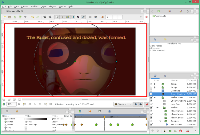
Taking the worker scene, it looked far to bright and airy, not at all like the confused, claustrophobic world into which the Bullet was born. To bring the focus back onto the worker, and provide a narrowness of view, I used a radial gradient over the top of the worker group, running from transparent to a dark red on the edges.
 The radius of this layer, like pretty much everything else, can be animated. This way, the field of view grows and shrinks as the Bullet travels along, obscuring the image. I did apply a fish-eye, or sphere distortion, which added to the confusion, but I pulled it: It was just becoming too confused.
To aid the idea that the Worker was near a furnace or a boiler, I applied a linear gradient, which I labeled ‘Heat Flare’ across his face to give it a rosy hue. I did something similar in the next scene, the Metamorphosis, to have the Bullet move from a hot red area to a cooler grey one, animating the endpoints and colours of the gradient as the scene progressed.
Text
Lastly, I had to decide between voice-overs or text. I have a microphone on my webcam, and another that I can plug in the back of the box. Neither, I discovered, were suitable for recording clean, crisp voice. In fact, I think I’ll have to get onto the whole sound portion of this clip in another post. In any case, I decided upon text to display contextual snippets.
To do this, simply add in a Text Layer. Type in the text as the ‘value’ and, Presto! You have words. I imagine one might want to animate words in or out, or type one letter at a time, but I went for a simple fade in / fade out option.
Changing the font is a tricky matter, though. You need to know the name of the font that you’re after. I opened up Open Office and scrolled through the fonts I was after, but the Windows Font Viewer will do the job. Put the name, verbatim, into the font family field and that’ll do the trick.
Because fonts behave like vectors, they’ll scale and rotate very nicely without all the pixelation.
Can you add a gradient to your text? Of course! Can you use your text to define the alpha channel of an underlying layer? Definitely (and how cool would that look?). The only real issue I found with text is that the rendering gets a bit jumpy if you try to animate the size. Maybe non-integer values aren’t suitable for the rendering engine, but I’d only be guessing. Everything else is fair game.
But an animation isn’t all just visual. In my next updates I’ll go over the music and sound.