Making the music for the The Bullet Animation was definitely one of the more fun aspects. I had a general tune going, I’d made a rhythm track and mucked about with the instruments.
Playing it back, it didn’t sound right. Sure, the tune was fine and the timing was correct, but there was something definitely NQR. It wasn’t until I played it back on my phone that it twigged: The instruments sounded tinny.
Timbre
No, not what one calls when a tree is cut down. I’m talking the quality of sound, the richness. If the sound coming out was colour, it would be a pastel, muted shade, not a rich, vibrant one. The instruments used sounded very much like those I was playing with back on the ol’ 386, probably because (and please correct me if I’m wrong) they were the same ones.
The ‘instruments’ used to play the midi file were the issue. Windows comes with a set of sounds that can be used to play midi files which is, well, average. So the piano, the harpsichord, the bass guitar, all sound like they’re supposed to. Kind of. Ish. If you squint.
“OK,” I reason, “It’s just a matter of getting a better quality set of instruments.”
In a way, yes. Only the correct term is Soundfonts. You can think of it like text-fonts. You’ve got your standard set of Arial, Times New Roman, Courier, Helvetica. Throw Comic Sans into that mix. They serve a purpose, they’re a good, vanilla set, and you can make them bold, italic, underlined, yeah, but they aren’t particularly interesting. Now you can get a whole bunch of fonts, of all different shapes and themes to suit a bunch of purposes. Different fonts make things interesting.
SoundFonts
The default Windows soundfont is decidedly average. In Anvil, it was the default midi synthesizer. I looked through the help and it seemed easy enough to add other synthesizers as well, and with the free version of Anvil, I can have up to two. Hey, I’ll settle for one good one.
I went online and downloaded VirtualMIDISynth (http://coolsoft.altervista.org/en/virtualmidisynth), which acts as a virtual midi endpoint, something that can render the midi files. By itself, it’s just an empty sound studio – I needed to fill it with instruments (I needed to download a soundfont).
Back to the web I went, seeking out this new ‘soundfont’ beast. Turns out they come in all shapes and sizes (just like normal fonts) and range from a few megabytes to a few hundred. What’s the difference? Well, I started with the ‘few megabytes’ option and ended up with a single instrument, a piano. It sounded nice, a lot better than what I had, but I was after a lot of instruments, not just one.
Have a look on the VirtualMIDISynth webpage for links to soundfonts. I eventually went with the Fluid Soundfont (http://www.synthfont.com/soundfonts.html), after trying a bunch of others, and I got a tiny glimpse into the world of sampled sounds. If time permits (Ha!) I’d love to revisit this and play around with some of the really cool soundfont sets I downloaded.
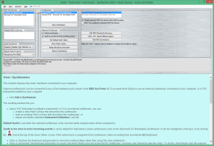
To use it, I opened up VirtualMIDISynth and chose the Fluid GM Midi soundfont set to use. Then, inside Anvil, I went into the synthesizers tab, chose to import a new synthesizer and picked my VirtualMIDISynth. After that, it was only a matter of selecting the instrument for the track and listening to how much better it sounded.
If only I could have done the same kind of thing for my sound effects.
Other Complications
Not really a complication in a technical sense, more so that when I finished composing the main tune, I played it against the animation. Who would have guessed? It was too long. I had the choice of either upping the tempo, which made it sound ridiculous, or removing a slab of twiddly bits from the middle.
It wasn’t a complicated task, removing some notes and pushing the ones over that side to over this side, except that the twiddly interlude bit that got ripped out was a sort of bridge between two different keys. Playing the resulting set revealed a dissonance that highlighted the rift between the two parts. In the end, I highlighted the offending section and, using the power of Anvil, shuffled them down a tone or three. Job done.
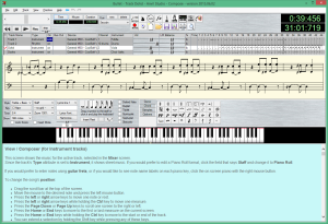
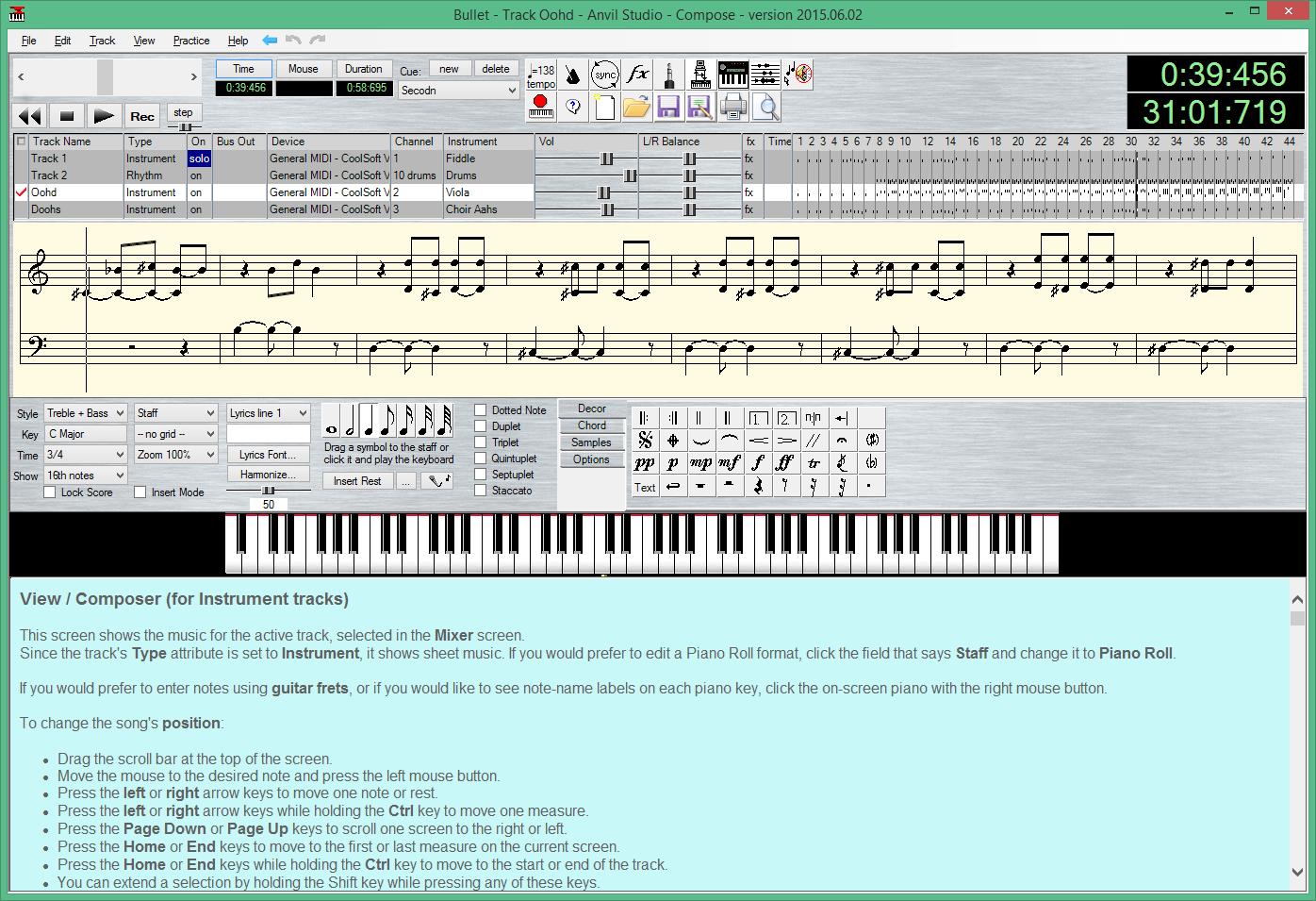
 I wanted the musical piece to run from a simple tune and get incrementally built up to a crescendo. The short animation time meant I was left without a lot of run-up space, so I broke the music into parts and added the rhythm track and the accompaniments in varying stages, putting it all together at the end.
The accompaniment tracks started off sounding very boring and flat: Just a single note played for each beat. To spice it up, and to allow a bit of dissonance as it progressed, I changed them to alternate between Oom-pa-pa and (rest) Ba-da-ba.
So they go Oom-pa-pa, (rest) Ba-da-ba, Oom-pa-pa, (rest) Ba-da-ba. Then, as I like, I can adjust one pa to bring the piece up to another key, or replace an Oom-pa-pa with a Ba-da-ba to add a bit of urgency. I’m sure there’s a musical term for this, can’t tell you what it is so don’t ask.
Lastly, by the time we get to the last phrase, there wasn’t enough behind the crescendo. Sure, it hit the high notes (better than I could!) but because everything had gone up by an octave or so, there was no bass left. To round it out, I inserted some simple bass notes to keep the whole thing grounded.
Whew! How about that! Music is done. Now what? Well, in my next post, I’ll show you how I brought it all together.

