

Pushing the digital version of your book to hardcopy requires a revision of your front cover. You’ve knocked your cover up. You are pretty chuffed with it because, hey, everything is just as it should be.
Pixels are, after all, pixels.
Printing out a cover throws a couple of curve-balls. Two notables are colour and cut.
Cut!
Cut is the easiest to explain. When a book get made up from a printing press, there are a number of processes and physical factors that need to be accounted for. Pick up a book off your shelf, go on. See how the cover stock is different to what’s used inside the book? See how it’s glossy, whereas the pages are not? See how the pages perfectly line up with each other?
It’s not an accident. The machines that make up a book have various tolerances when assembling, and then the whole thing gets trimmed to perfection. Aah!
The trimming bit is where you need to be concerned. Your cover will have bits cut off. I’ll repeat that because it’s important:
Your cover will have bits cut off.
The top and bottom edges, and the edge opposite the spine, are ear marked for a bit of slice-and-dice action. Lulu gives you templates you can use:
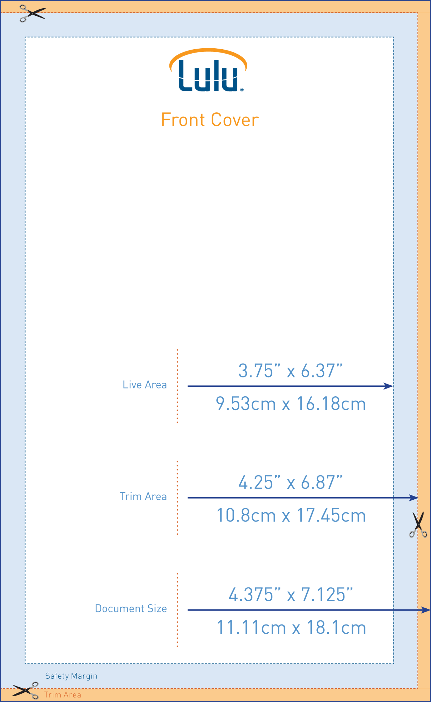
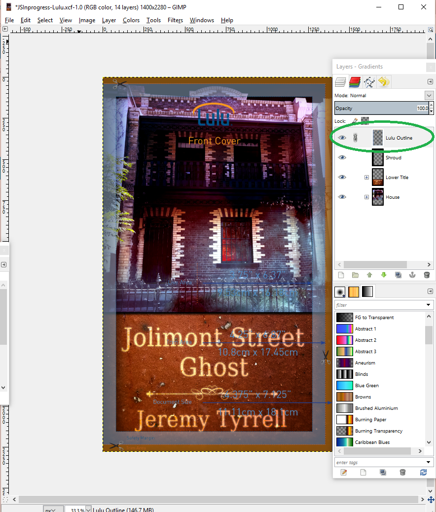
This one is for the PocketBook size, and as you can see, it has three distinct regions. The ‘Trim Area’, the ‘Safety Margin’ and the ‘Live Area’. If you use Gimp or Photoshop, add the template as a top-level layer so that you can see how your cover will end up:
Notice that all words are within the safety margin – no one wants to have their title sliced off! And, before you ask, yes, I found this out the hard way. The margin of safety is there for a reason. Use it.
What’s not so obvious is that the centre of your image is now a wee bit to the left. Doesn’t sound bad, until you get your book and that ‘wee bit’ has turned into a ‘Hella lot’! Realign your words, shadows, etc to align to the ‘new’ centre, and save yourself a headache.
Colour
If something looks good one your screen, great, it will probably look good on someone else’s screen, too, unless they’ve got their colours all up the wazoo. You can’t help that. In contrast (pun somewhat intended), if I look at a book, and then hand it to you, the colours on the front page haven’t changed.
So it is important to get it right.
I can’t really show you the difference as it gets printed out here, because my camera isn’t really picking up the details, but I’ll show you what I did for Adaptation:
 On the left is the digital edit, and on the right is the Lulu hardcopy edit. You’ll notice the words spacing and alignment has been adjusted for the margins of safety.
The colours are muted on the left, just the way I wanted them to be but, when it was printed, they appear especially dull. No good. So with the Lulu edit I upped the contrast, increased the saturation and use the auto ‘white balance’. The result is a more vivid cover, unsuitable for digital (I think) but comes out just right in hardcopy.![]()
[…] front and back […]
[…] is where your hard work shaping the cover will pay off. You’ve made the front and the back cover, in the correct dimensions, so all that’s left to do is upload those two […]
[…] to be correct, and the page numbers in the right spots, and Copyright and ISBN to be valid, and the cover to be up to […]