

You’ve got your eBook up and ready to be made into a print book. Bully for you! This is exciting stuff. You’ve done all the hard yards, now it’s just the tedious (but important) yards.
Lulu insists that, if you’re going to distribute your books, you follow some rules. These rules are fair, not outlandish or anything, but it can cause you some grief if you’re not sure what’s what. So take your time, go through this as a guide (not complete, but, hey, it’s a start), and be thorough: digital format allows you to update mistakes quickly. Printed format is quite unforgiving.
I use Open Office to write my books, mainly because I’m used to the interface. If you use a different word processor, the steps should be similar, although I doubt they’d be exactly the same. Maybe same but different.
Lulu uses PDFs as they content, but will also accept Microsoft Word docs and raw .txt files. In any case, I export to PDF before uploading.
Size, Format and Fonts
With eBooks, you write, and that’s that. The formatting is (mostly) up to the device upon which the viewer is reading. Sure, you can set the font and make this a heading and that bold, but readers can override your setting and change everything to Comic Sans (which is evil) if they’re feeling frisky, increase the line spacing, decrease the lines per page, etc.
A printed book, last time I checked, doesn’t have this luxury. So you now need to take off your writing hat, and put on your type-setting hat. Don’t worry, you’ll get through this.
Firstly, choose your book size (see eBook to Hardcopy – Lulu). Sounds obvious, right? Well, there’s more to it than just that.
What kind of book do you have? A novella? A tome? If it’s a light read, you might consider a pocketbook format. If it’s meaty, perhaps you’d like the A5 size. The larger the book, the more expensive it is to print per page, but remember that larger pages hold more words, and therefore each page is less expensive but, and here’s a rule: Don’t let the cost guide you. Rather let the book have what it needs.
What’s your target audience? Children? Teenager? Adult? Older-adult. This can give you a hint as to the size of your type, the spacing and the font type. Larger fonts for children and teenagers, maybe very fine fonts for epics and war stories. The size and type will affect the page count but, again, don’t let the number of pages lead you: choose what’s best for your audience and stick to that.
Now, the font. Pick up a book from your bookshelf. What’s the font? Serif or sans-serif? Does it have the little ‘flickety bits’ on each letter, or is are the characters straight lines? It’s a matter of preference, but I like to read books in serif fonts, and I’ve got my Kobo set to this, only because I find I can read easier and faster. Eh, up to you.
A Worked Example
Let’s start with Jolimont Street Ghost. It was an eBook, published with Smashwords, and I needed to make it into a paperback. When writing, I had everything as ‘default’, thus:
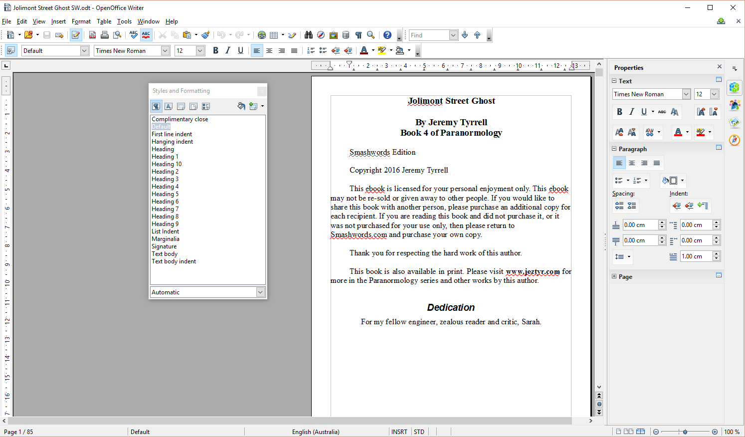
See how everything just runs together, including the copyright and the Dedication? All the front matter is rammed onto the one page.
We’ll have to change that.
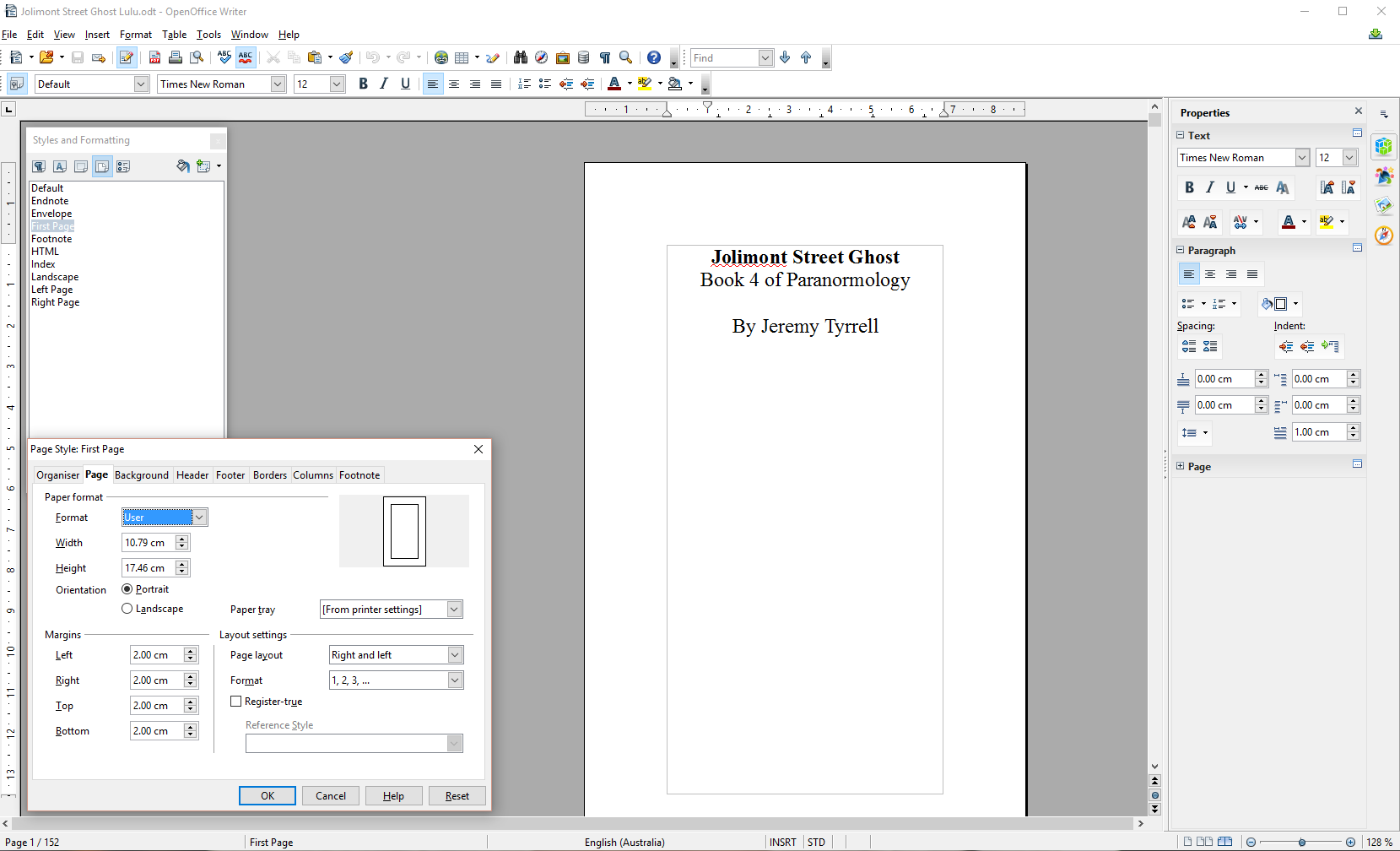
OK, like the rest of Paranormology, I opted for a pocketbook, it’s 10.79cm x 17.46 or 4.25″ x 6.88″. OK, so I set the first page and default page size to this. This is under Page styles (see below).
Front Matter
The first port of call is your front matter. Your eBook can’t just be printed out any old how, it needs, among a host of other things, to have a proper title page. That’s right, a page dedicated solely to the title, subtitle, series number and author(s).
Hit CTRL+Enter to make a page break under my title. I then click on the page with the title and set it to being a ‘First Page’. That is, I nominate that page’s type as a ‘First Page’. I then edit the margins to give me a 2cm clearance on each side. For a larger book, this isn’t so pronounced.
For the rest of the book, or ‘Default’ pages, I set the margin to 1cm. I’ve found this give a good clearance of the text from the spine – I have read a book once where I needed to practically breaking the binding to read the words next to the spine – and a comfortable reading margin from the book edges. Don’t worry about the little grey margin line, that won’t print out.
Set your font to ‘Title’, set your sub-title, series and author fonts to something a bit smaller. Put them centred. Job done.
Bummer. Lunch is almost over. Stay tuned, I need to get some more screen shots. Coming up, we’ll cover the rest of the front matter, including the copyright, ISBN and table of contents. After that I’ll show you how to add in page numbering, chapter titles on pages, tables of contents and images, and also what to look for when you finally hit the ‘go’ button.
Right now, though, I’ve got to get back to writing code.![]()
[…] the interest of comparison with Lulu, I’m going to documenting my experience with Kindle Direct Publishing and Create Space for […]